When I began working on Spectrum Scale they were in the middle of an abandoned re-design. The previous design team departed due to conflicts with the developers, and our design team was tasked with working with the developers to complete the re-design in what had become a time-constrained release window.
The 3 main improvements I was able to make in the short time before our release were:
- Navigation – streamline it from frustrating to fluid.
- Information – remove the tedium of retrieval
- Installation – make a complex product simple to install
Navigation
When I started working on the product it was separated into categorical navigation groups.
This separation into categories meant that navigation from one object to a related element first required a user to select the navigation category that the destination belonged to, then a sub-category by element type, and finally the target itself.
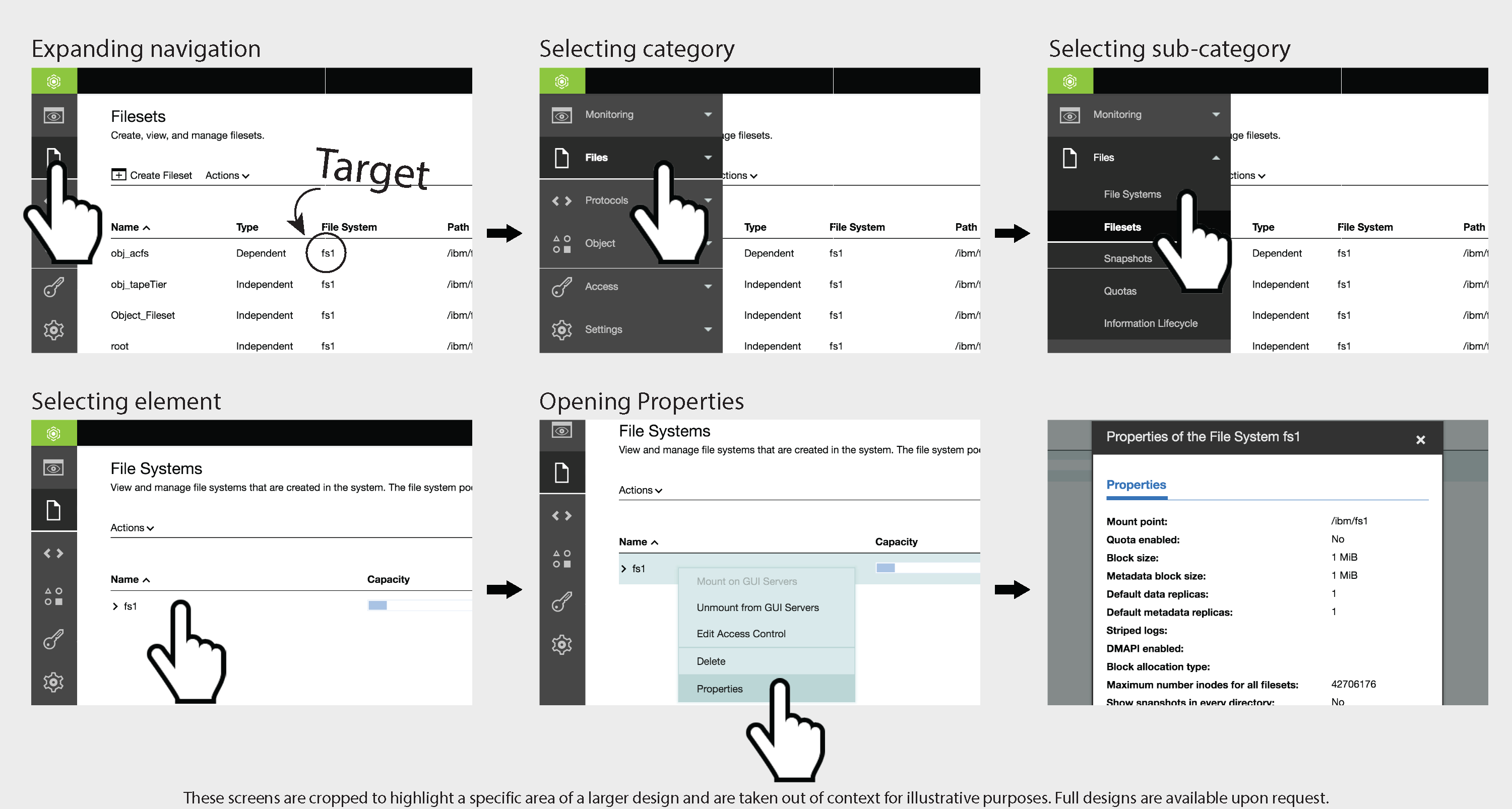
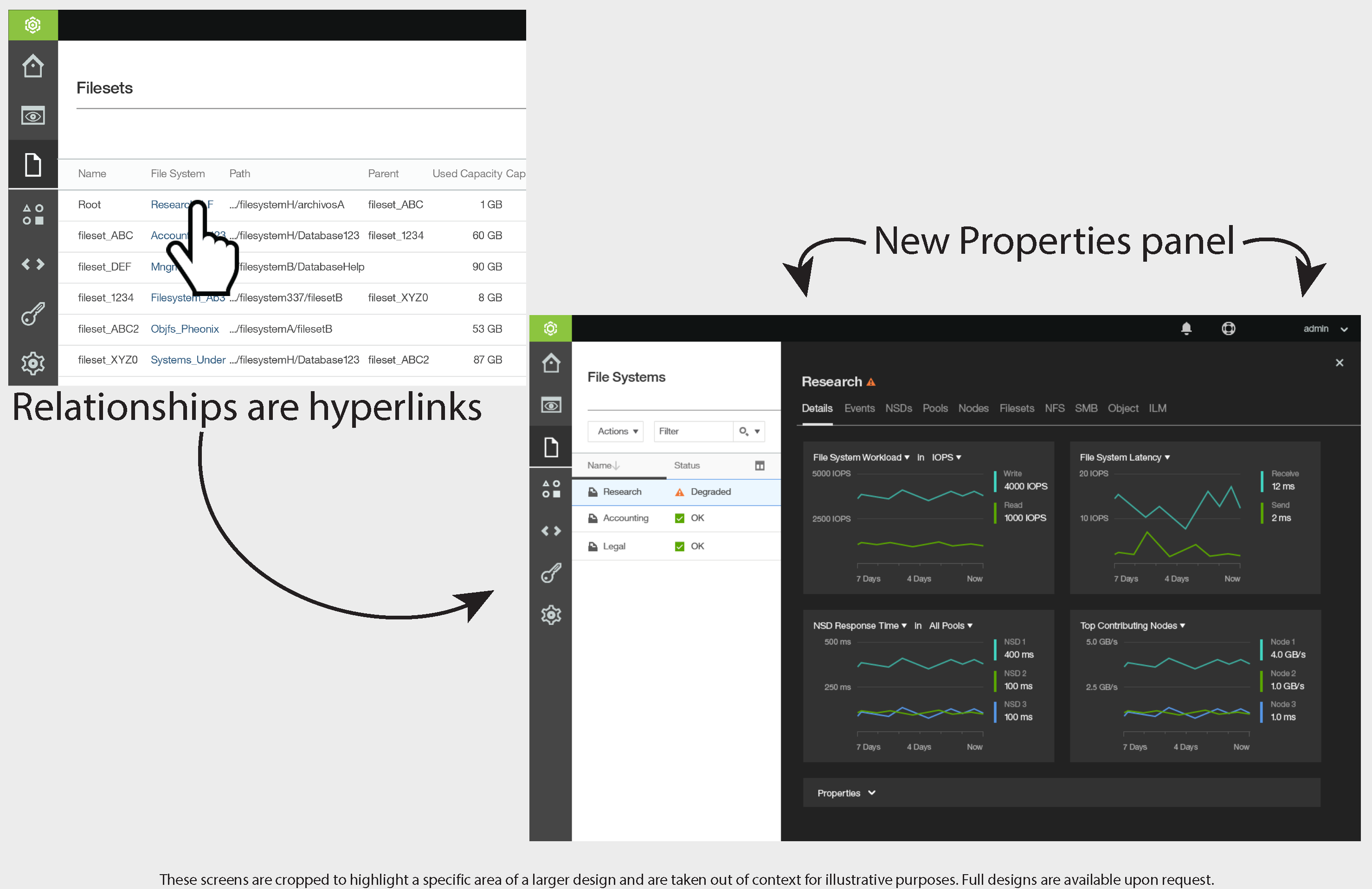
I streamlined movement and made navigation between related components simple and intuitive.
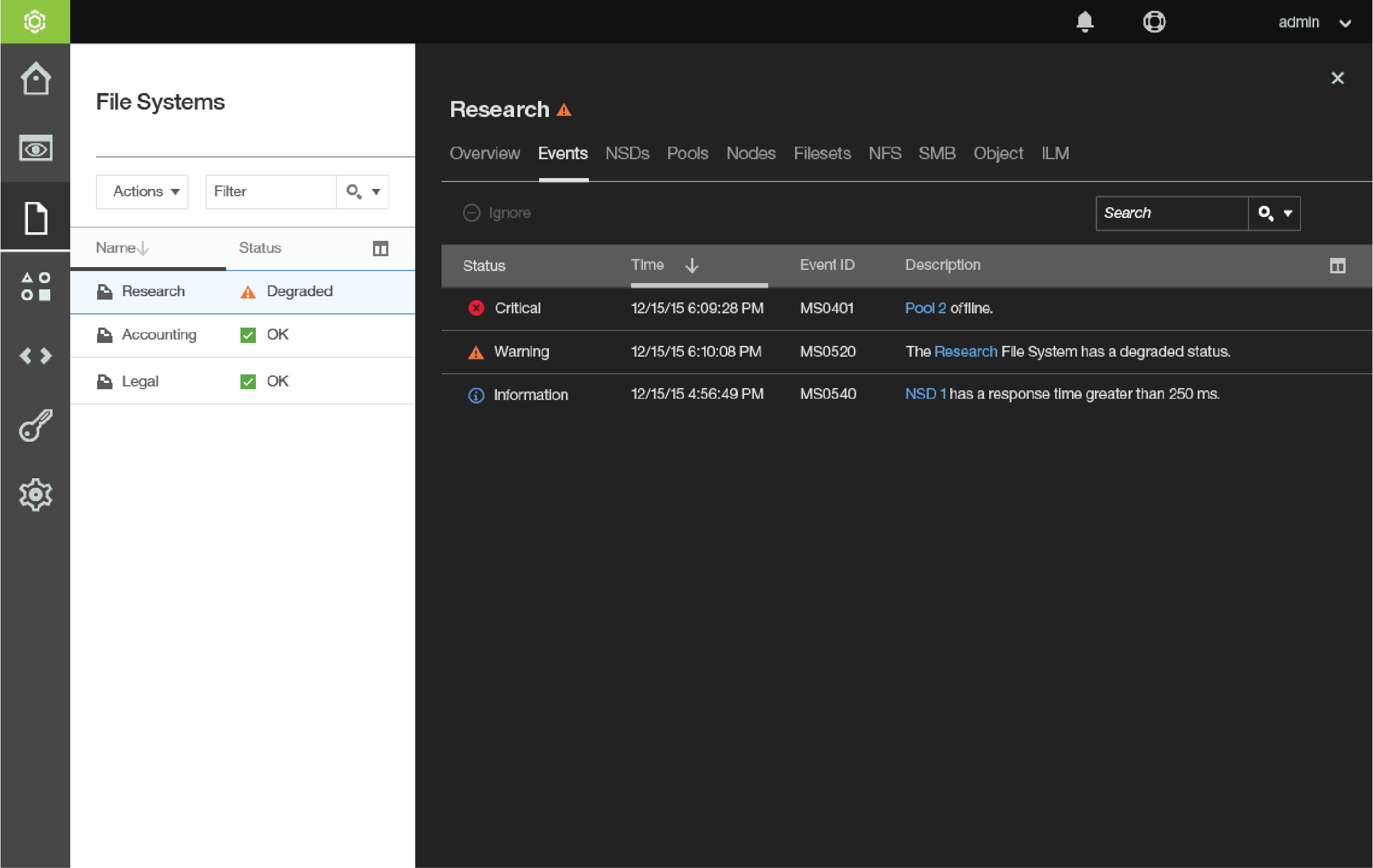
Information
With navigation streamlined, the user was able to simply transition between components. A major design flaw was ingestion of information.
Each component has a complex relationship to other components.
In the old design users were forced to reference 3+ properties windows to understand relationships.
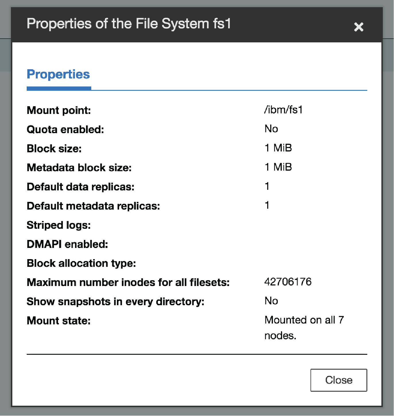
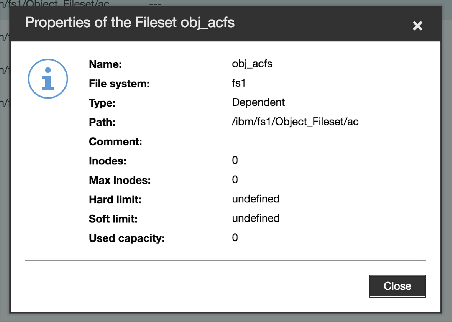
Multiple properties windows required to understand all information
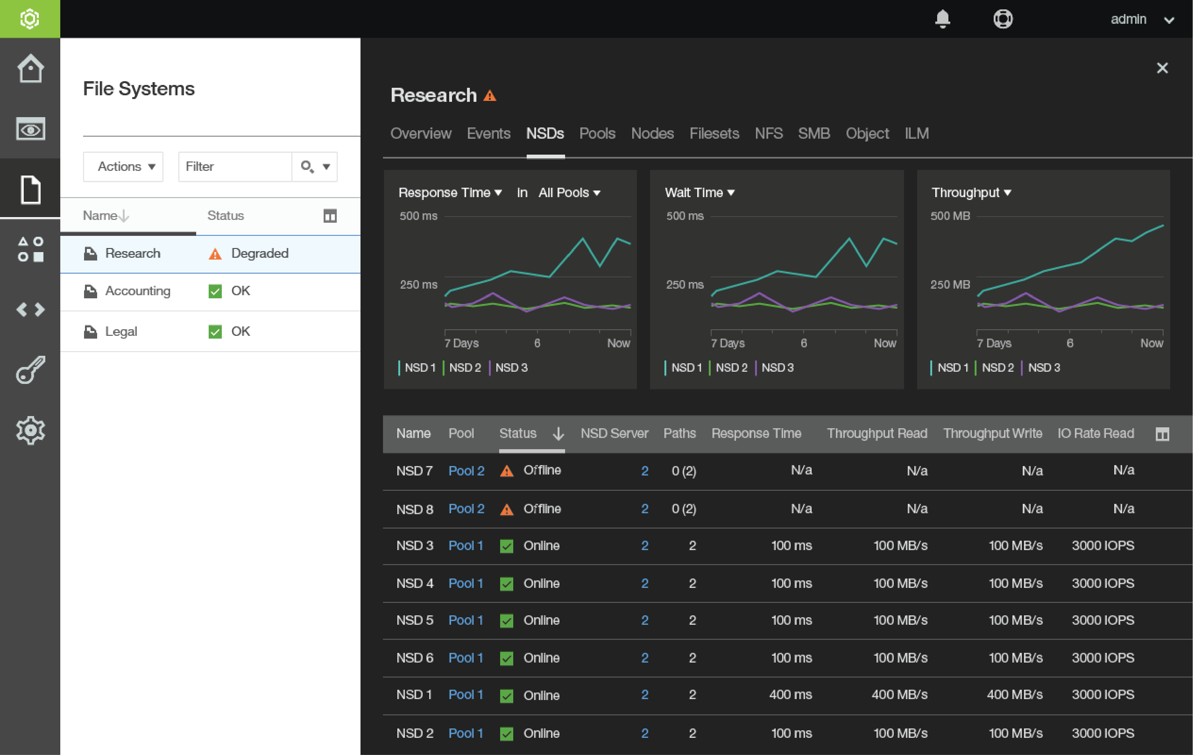
I expedited the laborious chore of retrieving information about the complex relationships between components by creating a Details Panel that provides a tabbed page for each component type related to the target object.
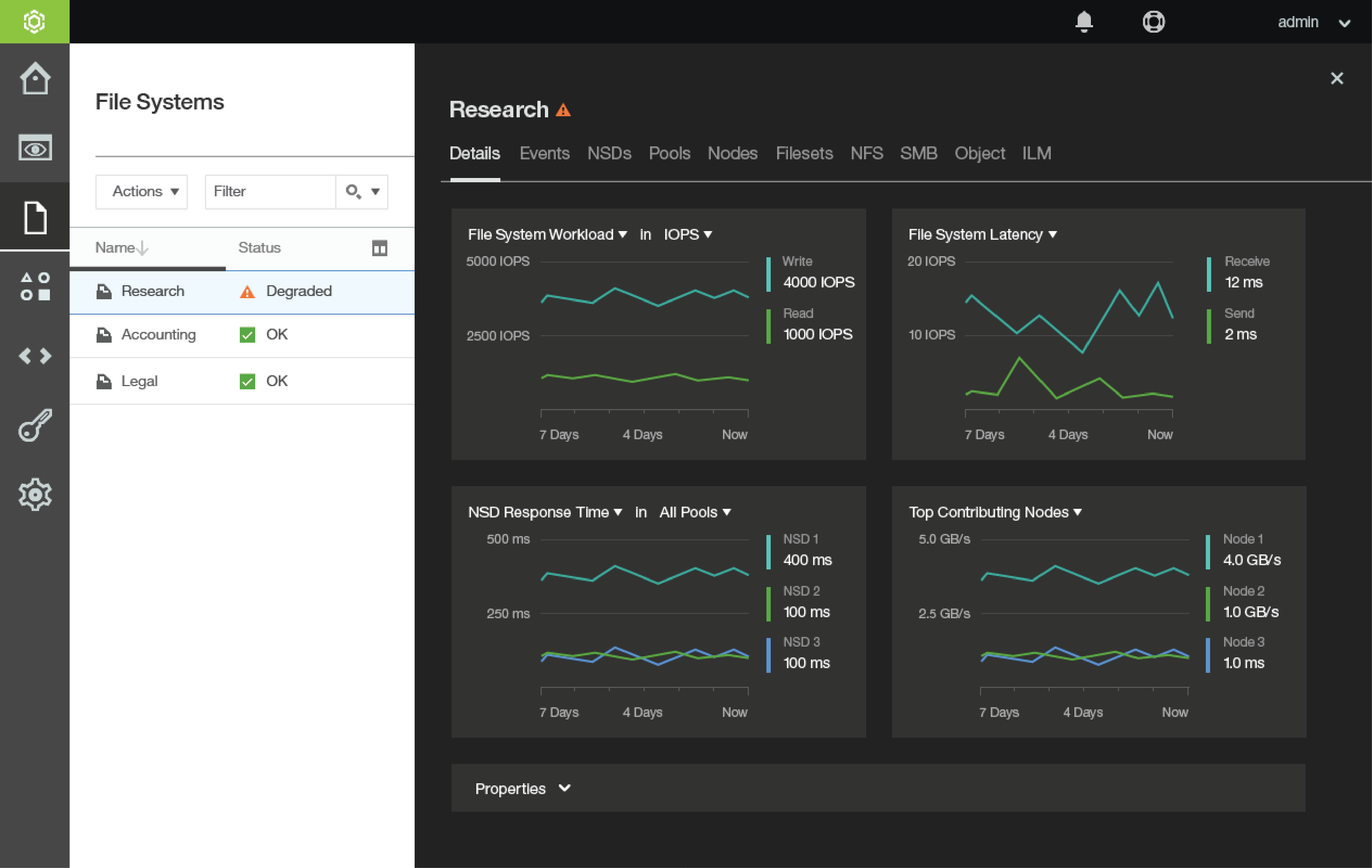
Information easily accessible via tabs
(note: visual design not completed)
Each tab shows information relevant to the components or concepts of that type which relate to the selected object.
Tab names are hyperlinks which navigate the user to the selected relationship.
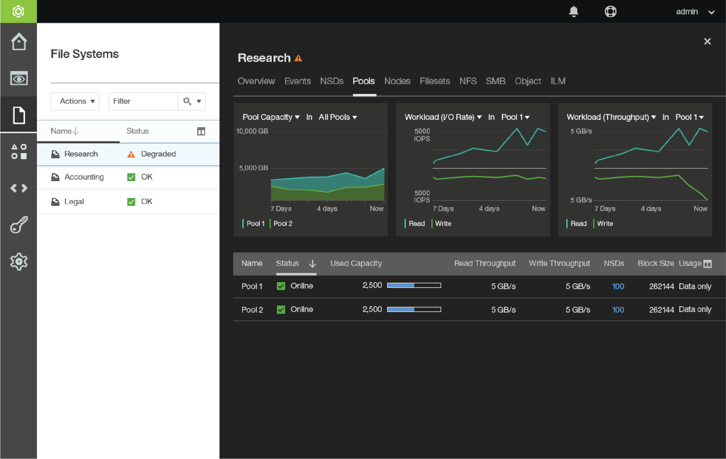
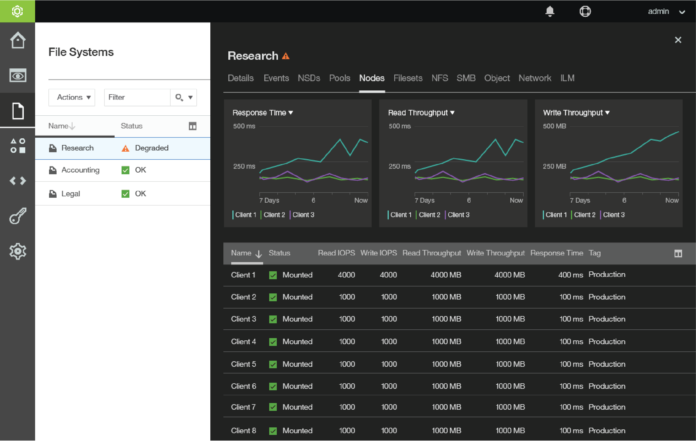
Proposed tab content prior to visual design finalization
(note: visual design not completed)
Clarifying Installation
Part of the abandoned design work included a half-finished installation wizard. After conferring with the product’s technical architects and stakeholders, I identified that the user’s main goals during the installation are:
- Add Servers
- Designate Server Roles
The designs that were provided for me to overhaul were confusing and difficult to use. Adding servers involved a cumbersome mix of an accordion navigation between 3 methods:
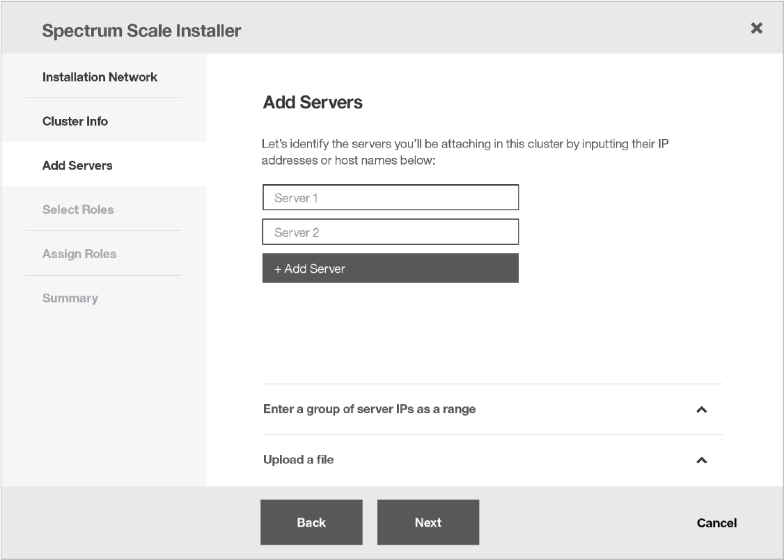
Existing designs as provided to me involved an accordion
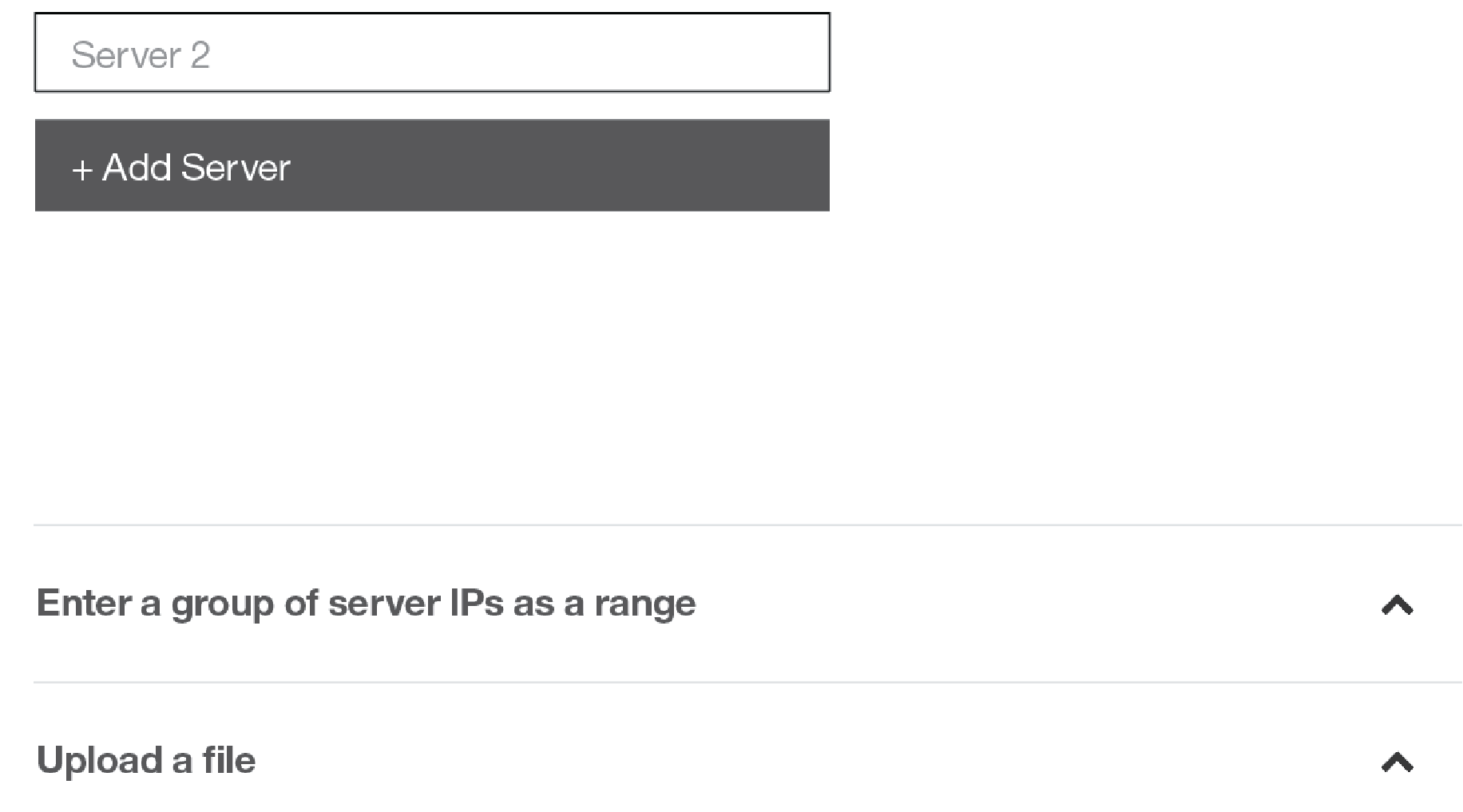
Keeping track of your servers across the sections was difficult
Adding as a range section expanded beneath individual server addition
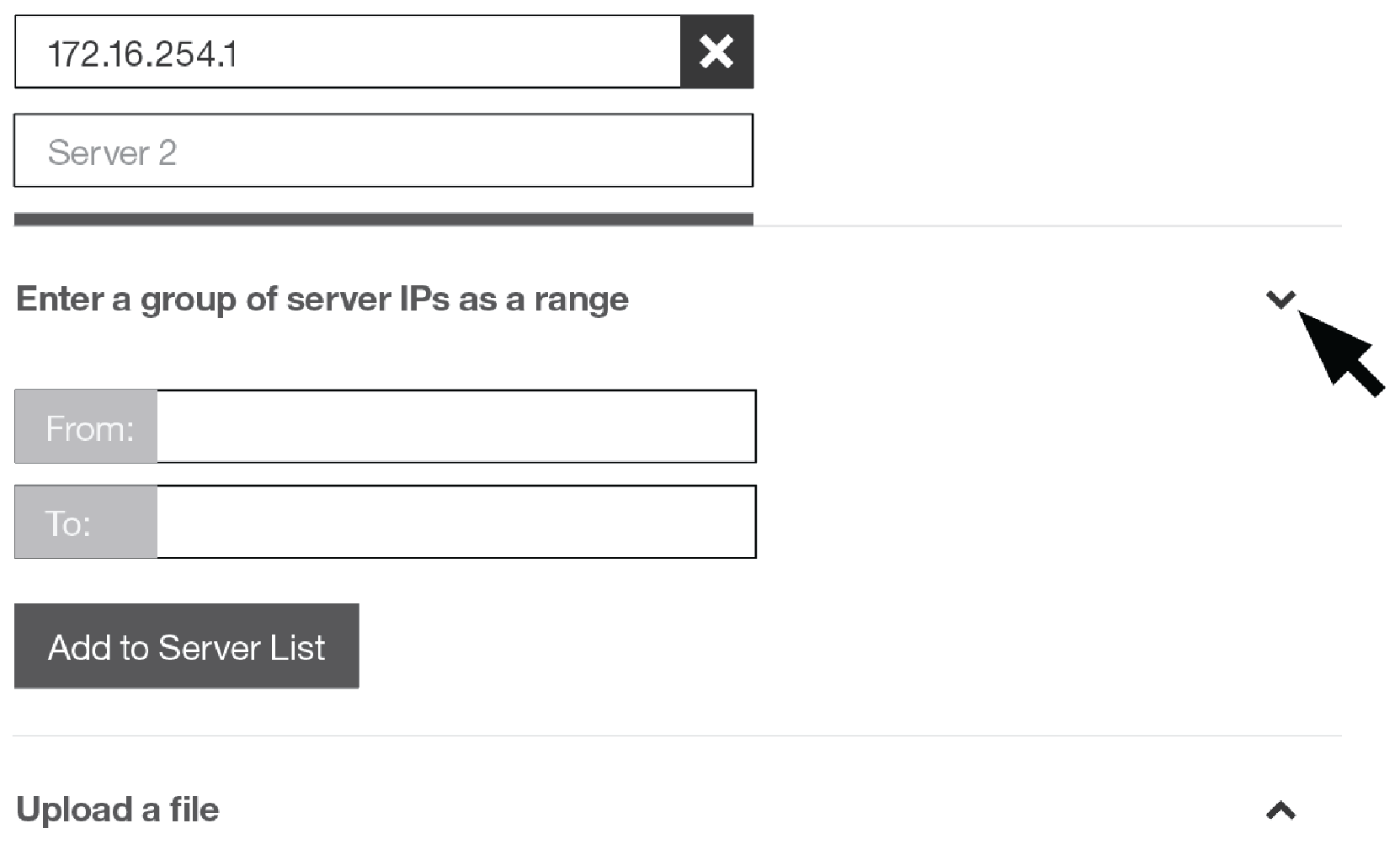
After meeting with the product’s engineers and familiarizing myself with the use-cases for adding servers I spoke directly to customers to verify that 3 separate methods of server addition were necessary and served distinct purposes.
My updated designs simplified the interaction without compromising any methods of addition.
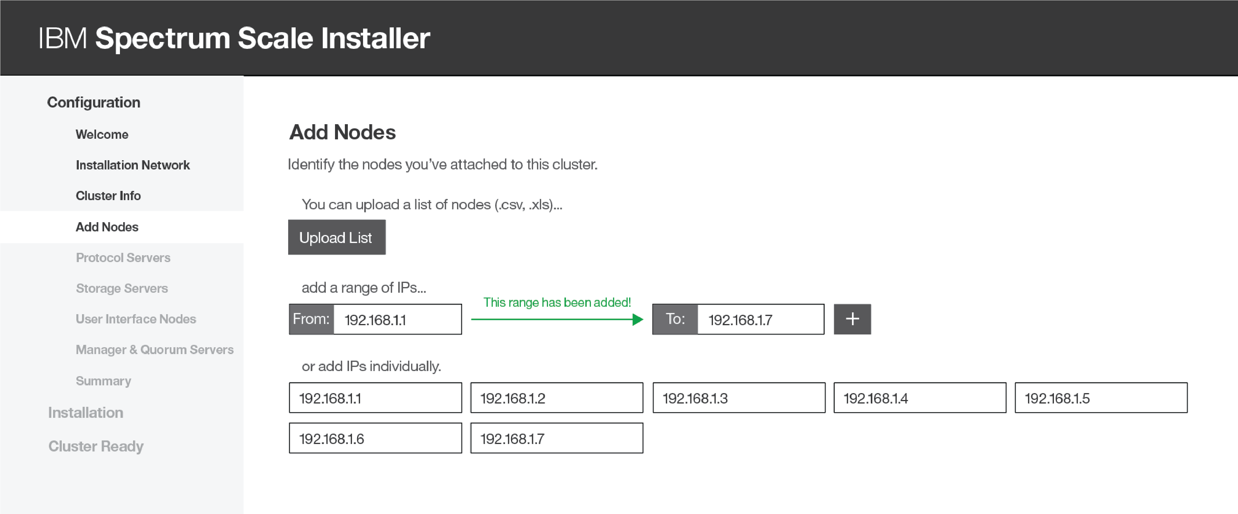
My updated design enabling users to add with any method
The original design for Designating Server Roles assumed the user had knowledge of specialized terms, relegating the explanation of these terms to a help document link.
The user was forced to make many nuanced decisions about their environment in one screen with little help or context.
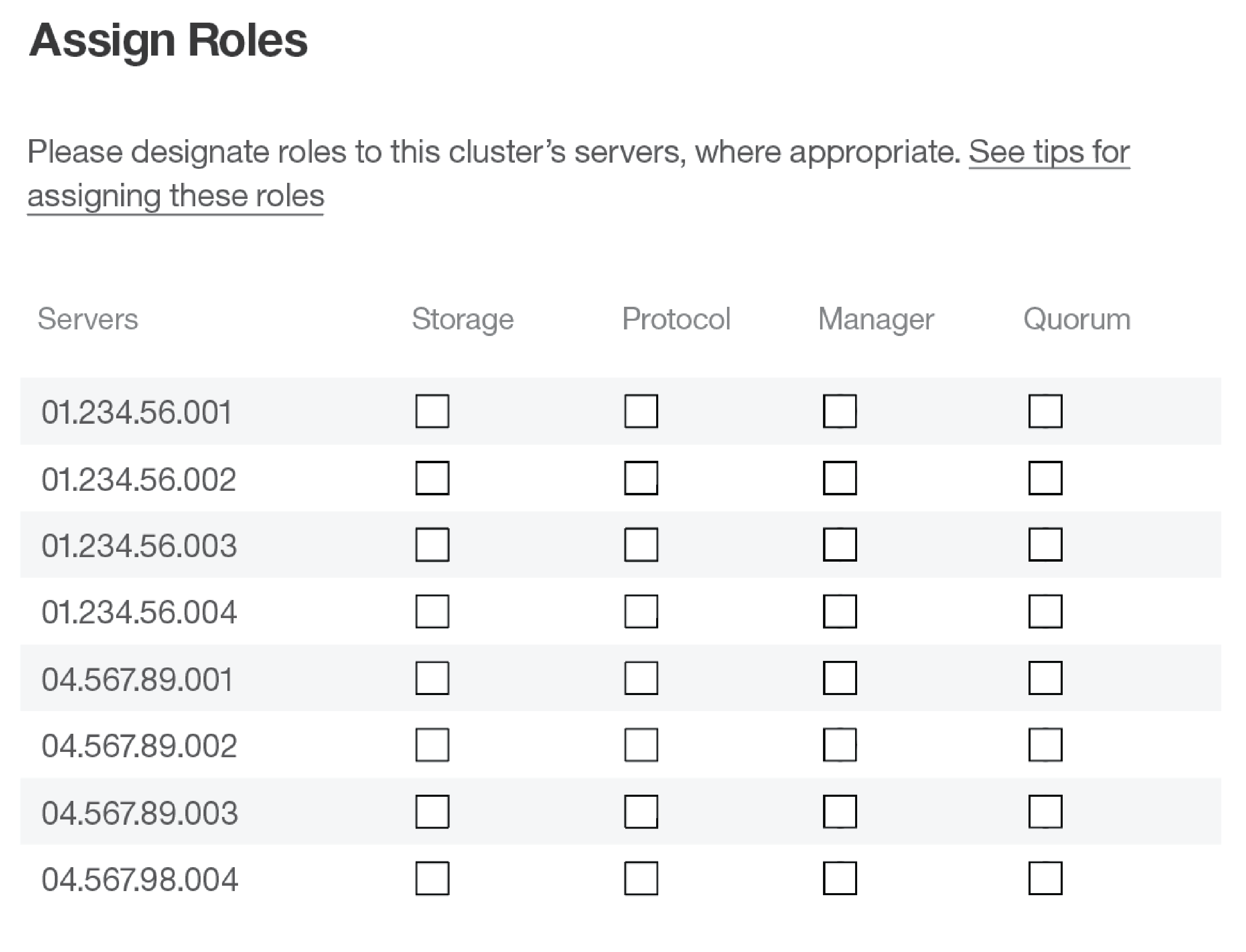
Original bulk assignment method with no context regarding what these choices mean
I re-imagined the complex and cumbersome mine field of checkboxes to achieve the same result with a series of simple, straightforward questions that progressively show the structure of the user’s environment.
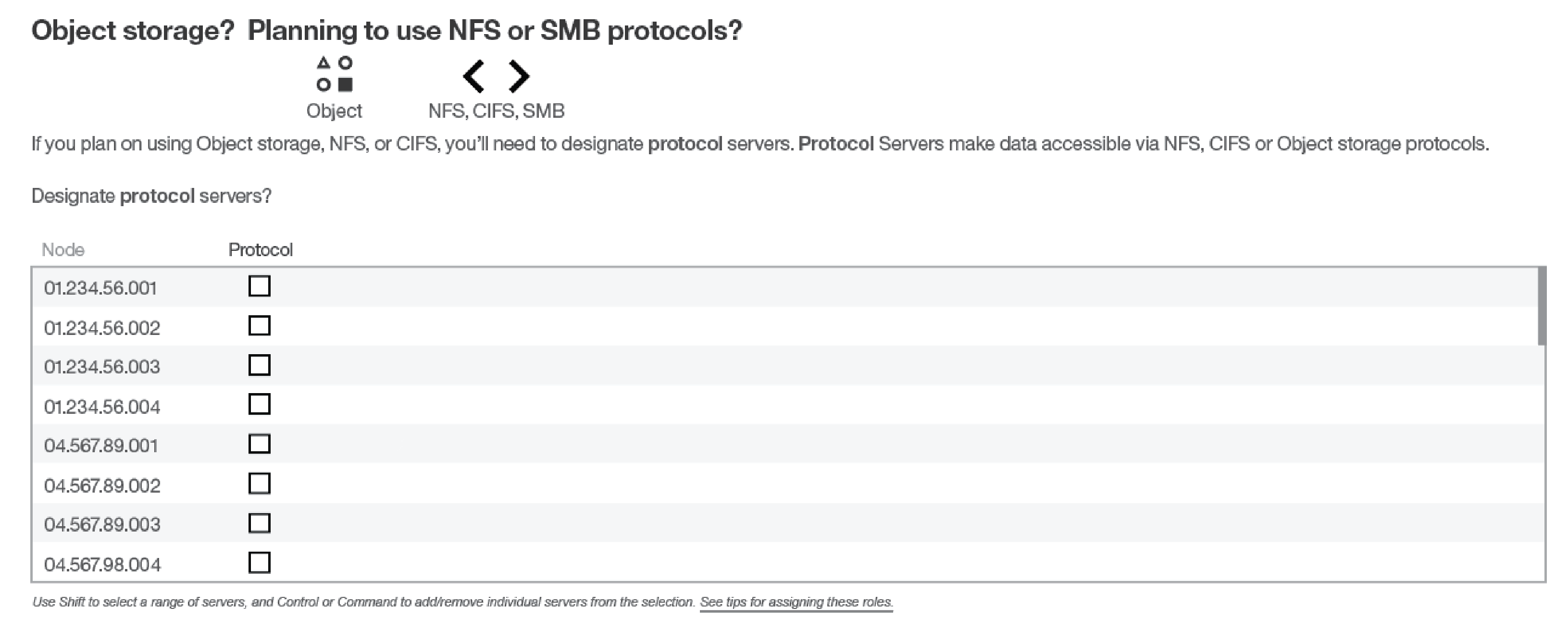
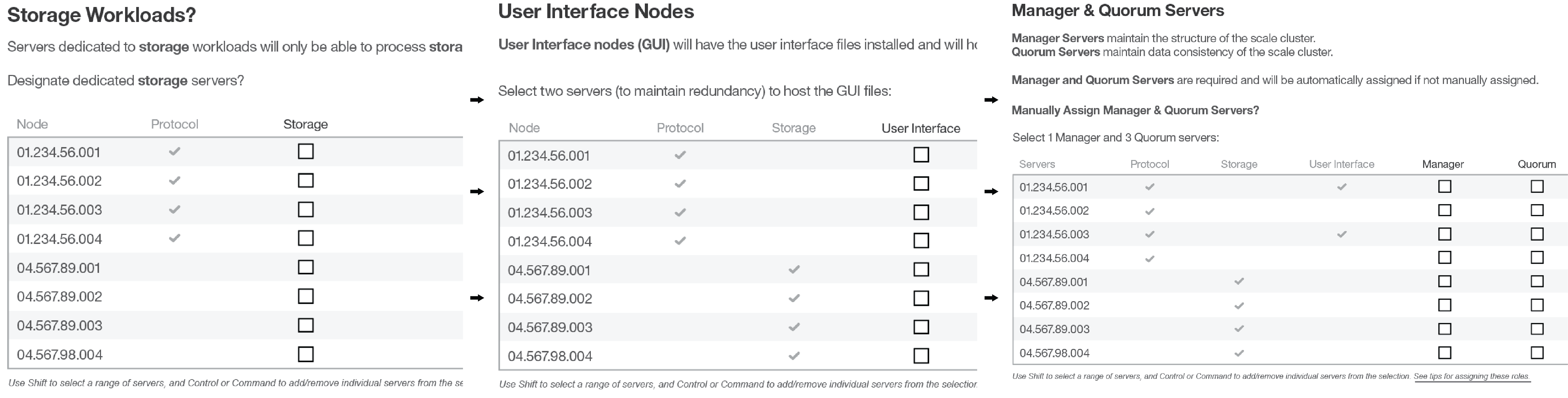
My progressive-disclosure method explaining and isolating each choice
Finally, the conclusion of the simple questions provided the user with a comprehensive view of their prospective installation. Before the summary page was released, an edit capability was added to enable the user to modify their selections before completing.
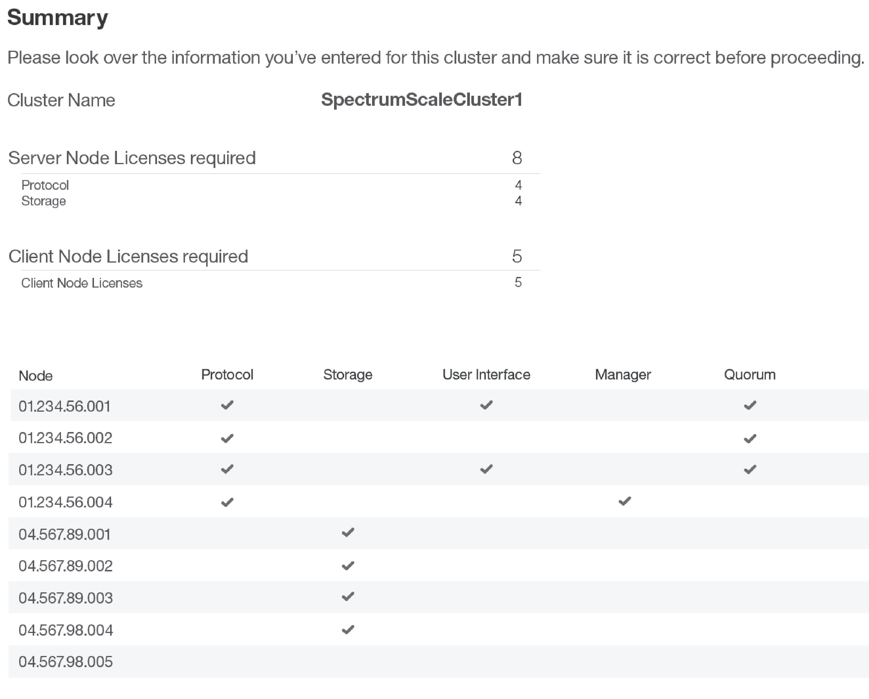
Summary page displaying your final configuration