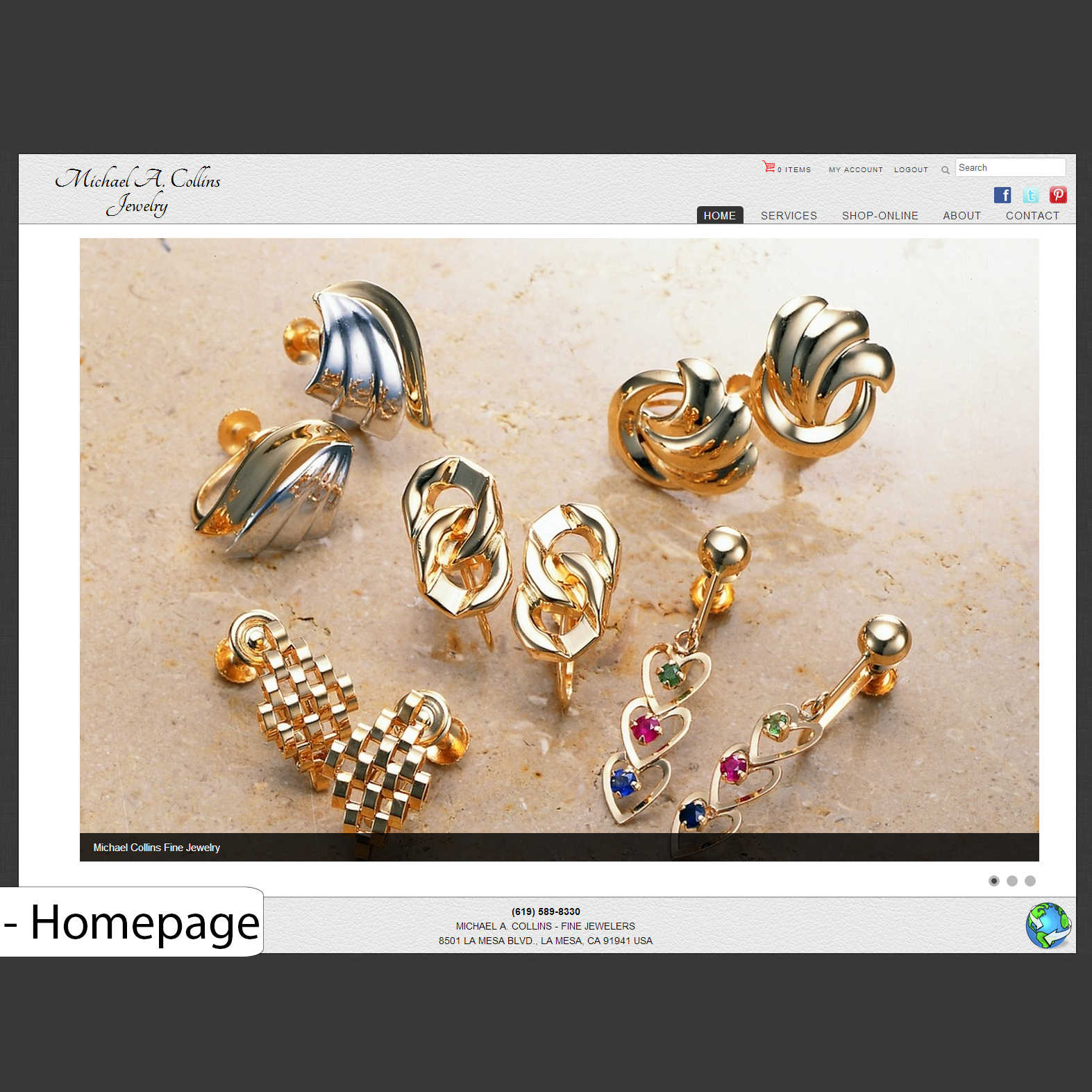
This Setup Experience project followed the Understanding Storage project, and I was actually inspired by that project to suggest it. The understanding storage experience I created was received so well by our executive chain and offering management, they wanted it to become the default page users saw when logging into Storage Insights. While thinking about how our user would be introduced to the experience the first time they used our product, it became painfully clear to me that our product had no real onboarding or setup experience. No other setup experience existed in our product. Since the experience I created wasn’t designed with the first time use or product setup in mind, and no other part of our product accomplished the task of onboarding a new user, it wasn’t obvious to a user how to populate the product with devices.
The existing installation procedure was to follow a link that was sent to the registering user’s email and download a zip file, then follow text file instructions within that zip file which explained how to install a data collector. The data collector sends storage system information to our product for you to view, and without it our product is very limited. This procedure was unpolished, less clear than we wanted since there was no interaction and the user must rely on a text file, and left a poor first impression on our customers.
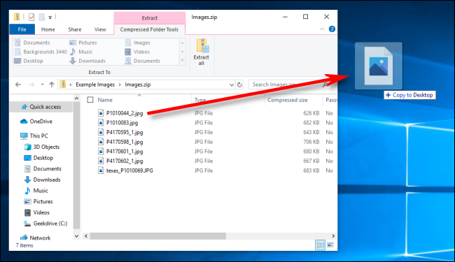
Illustration of what the process was like
Pitching My Idea
As I finished up the understanding storage project, I suggested in our team slack that we make a “big simple button” to setup the product. Below is a quick mockup I threw together in about 5 minutes to get the point of my proposal across. In my explanation to the team I pointed out how painful it was for users to figure out how to do this currently, and highlighted that with a small amount of guidance we could make this experience simple. The setup process consisted of 3 main steps:
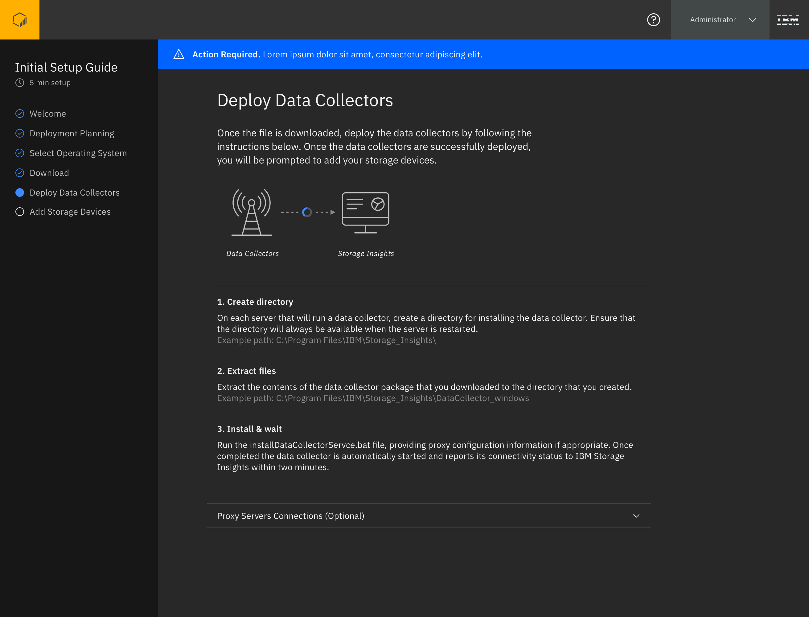
- Download the data collector software that runs on your server to send us data from your storage.
- Install the data collector on a server.
- Once the data collector successfully sends data to IBM, add the storage you want to monitor to Storage Insights.
My role on this project was the sole UX Designer, the sole UX Researcher, and I collaborated with my team of designers who were also working on the product at the time, as well as a content designer. This collaboration took the form of reviews and feedback sessions where I would briefly recap the user’s need, walk the team through the design proposal, and focus on any iterations I had made since we last met while highlighting what part of the design those iterations addressed. I leveraged the newly released Carbon Design System for the style, and worked with a visual designer to finalize the look. My work with the visual designer on my team involved him advising me on better uses of space within the design to make the content more consumable, color suggestions and color schemes (dark theme was his idea), and we worked together on the data collector visualization seen at the right of the experience. He created the graphics, and we both worked with our data collector subject matter experts and a copywriter to define the objective of the graphic and content within the graphic.
My simplified setup pitch concept page 1
My simplified setup pitch concept page 2
My simplified setup pitch concept page 3
Alignment & Layout
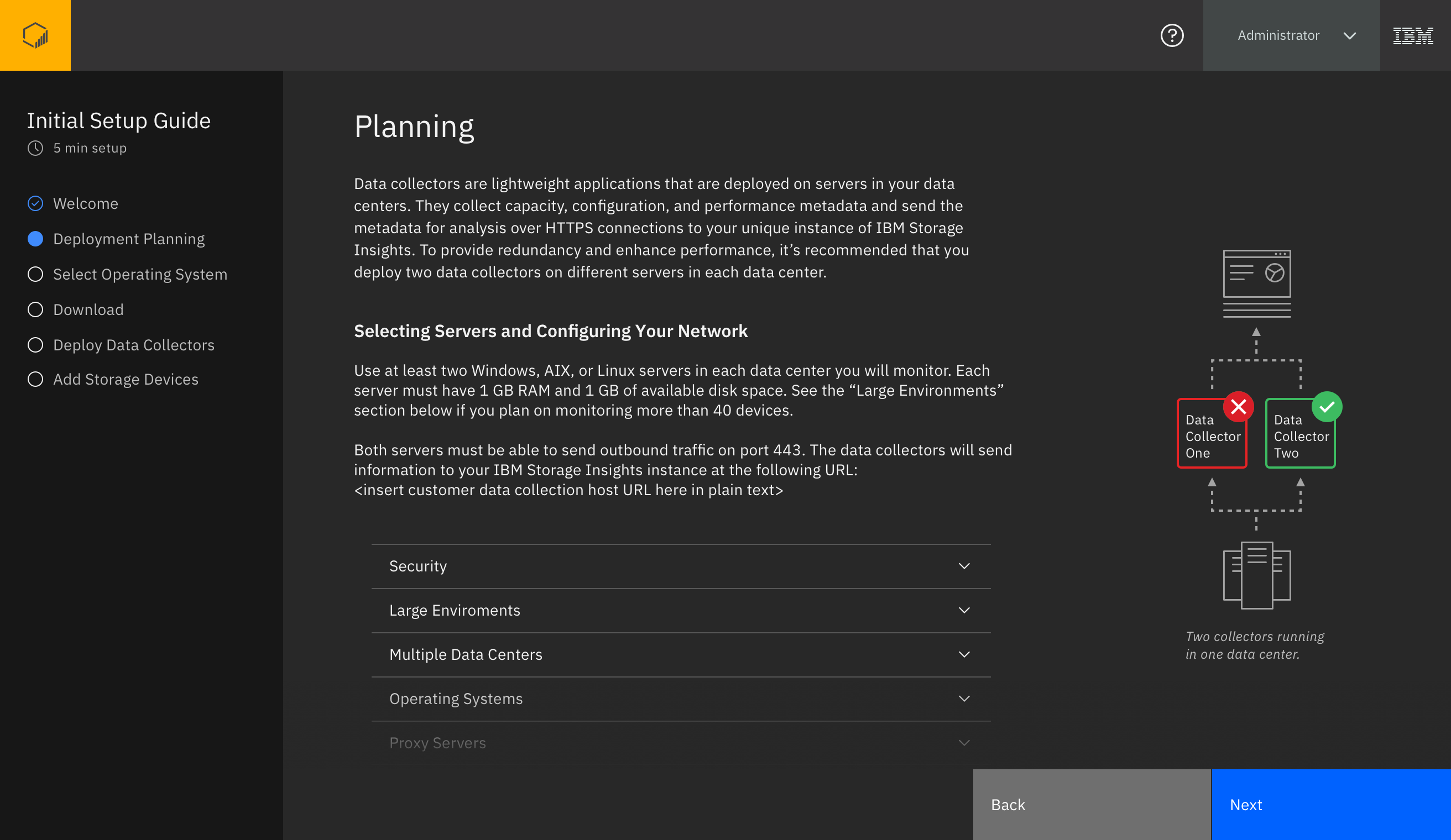
My first goal was to establish stakeholder alignment on the set of steps the user must complete to set up their environment. In the image below you can see the two basic use-cases, and how a user would progress through each:
- The primary use case is a user who has never entered our product and needs to set it up.
- The secondary use case is when someone already using our product wants to deploy additional data collectors for some reason, which is far less common.
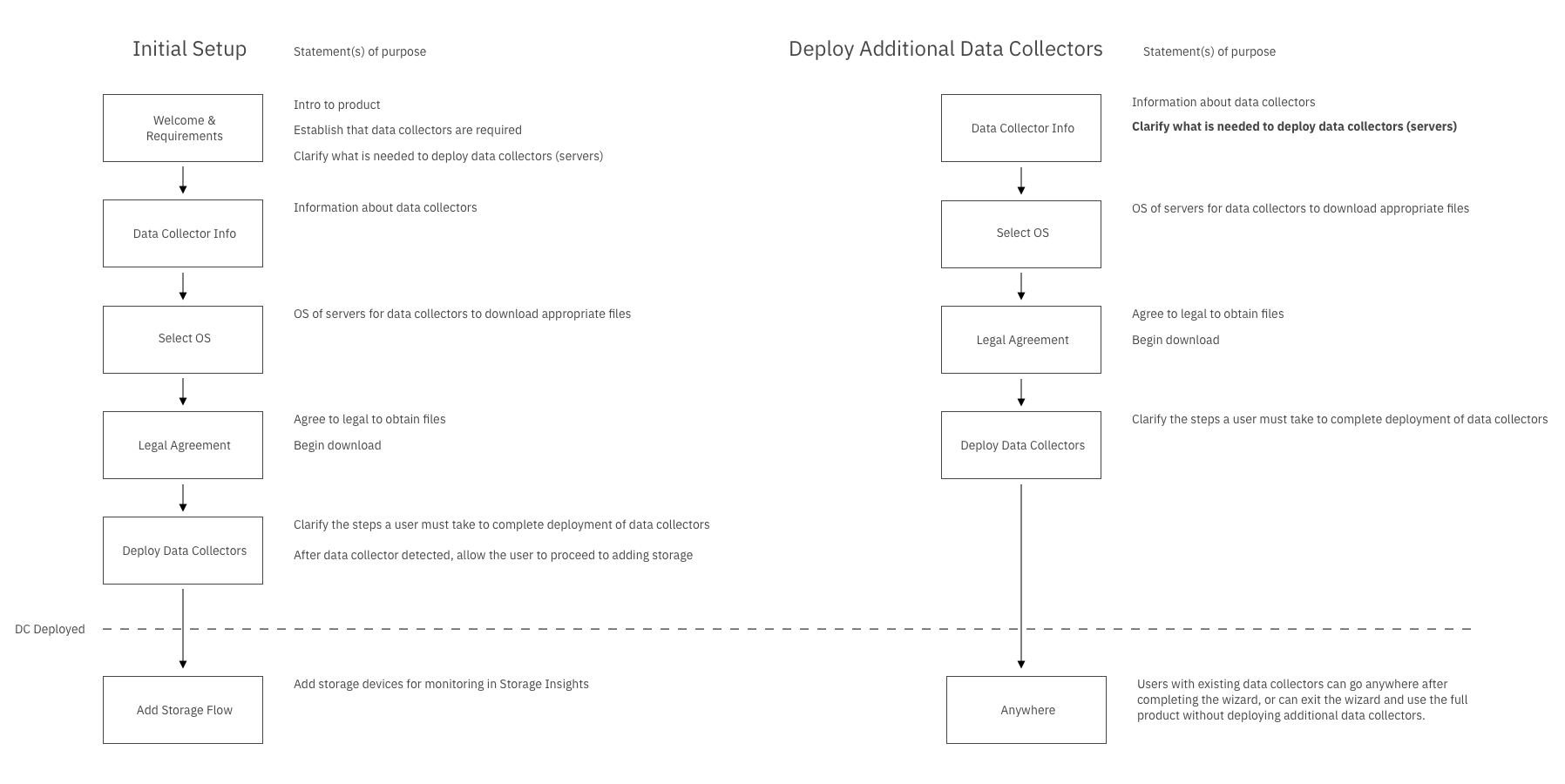
A quick flow document to align on the required steps for setup
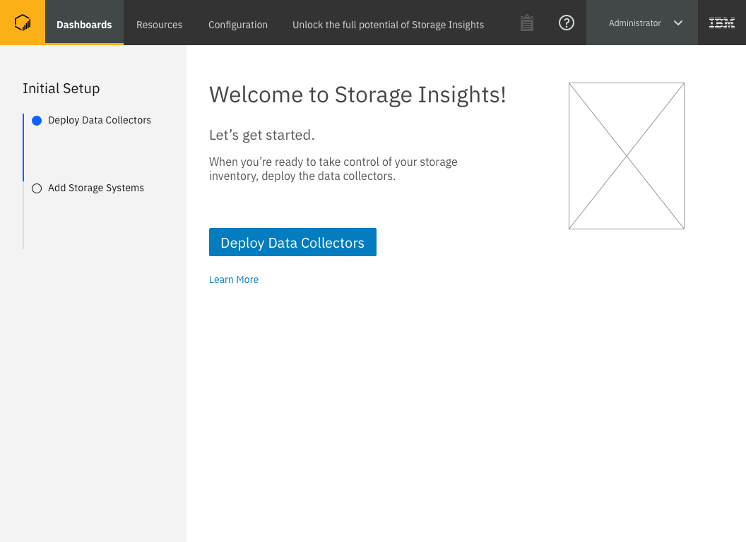
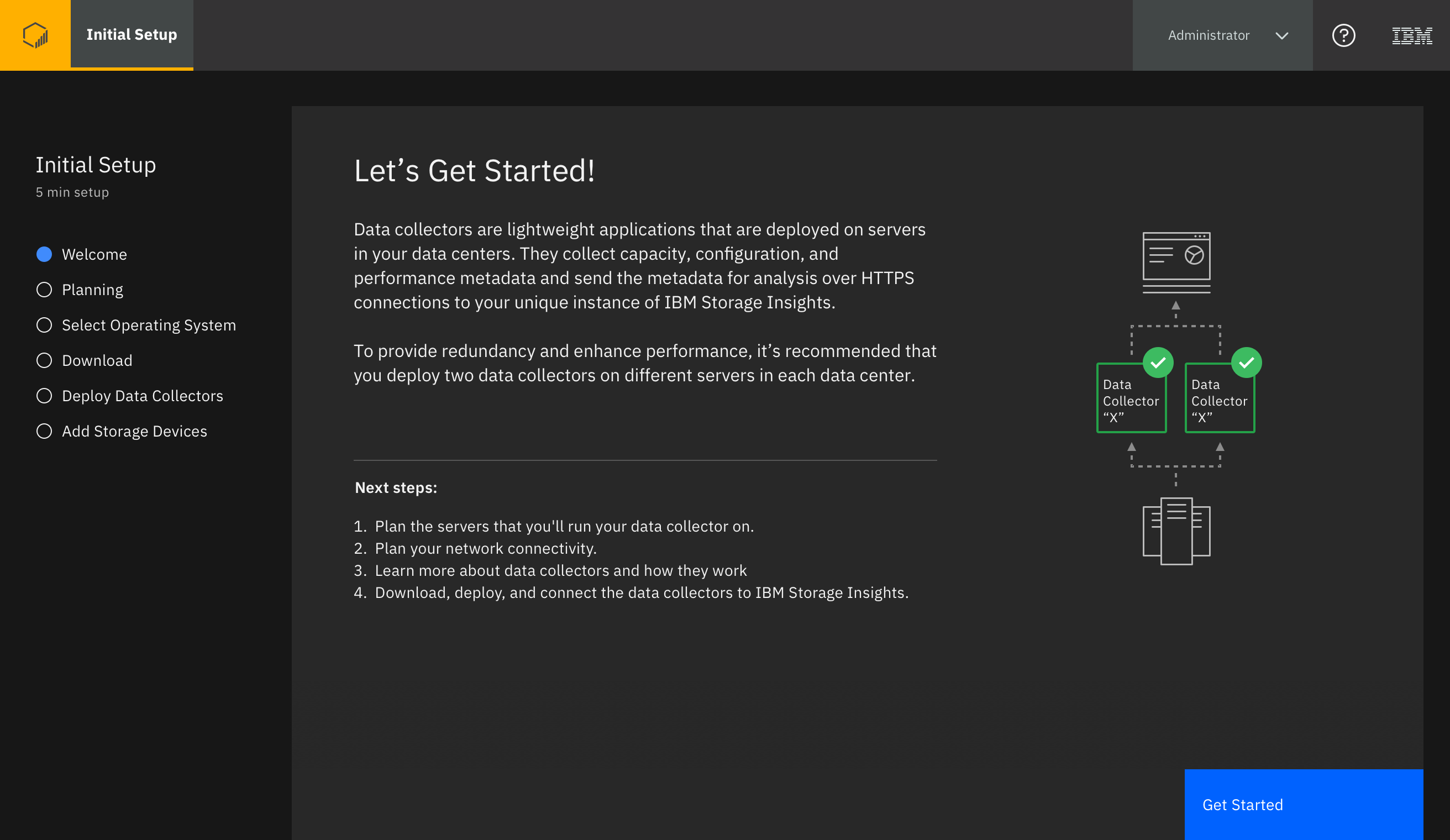
I drafted a rudimentary workflow proposal with specifics for each page and presented it to stakeholders for comments and updates, and so that the stakeholders and I had the same targets in mind. Then I used our new Carbon Design System widgets to quickly put together rough approximations of what I proposed for each screen. I did this to facilitate a conversation with my design team around what this experience might look and feel like. I proposed that our first screen would welcome users and explain what we’re about to do together to get them set up.
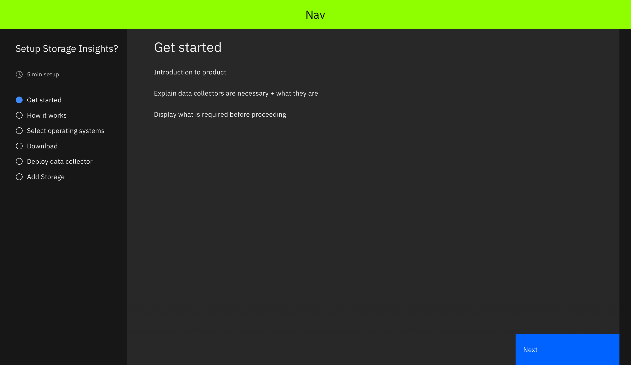
Blocking out the look and feel of this experience using the Carbon Design System widgets
In the screens following the welcome page I thought we should explain a bit about the technology:
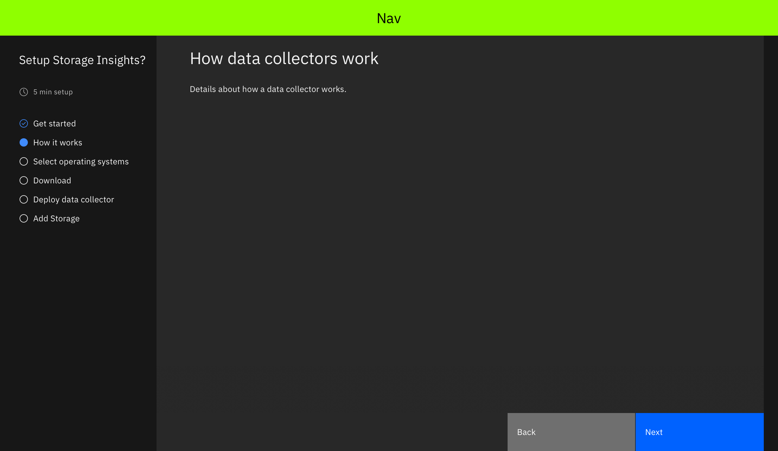
Here we will explain what a data collector is
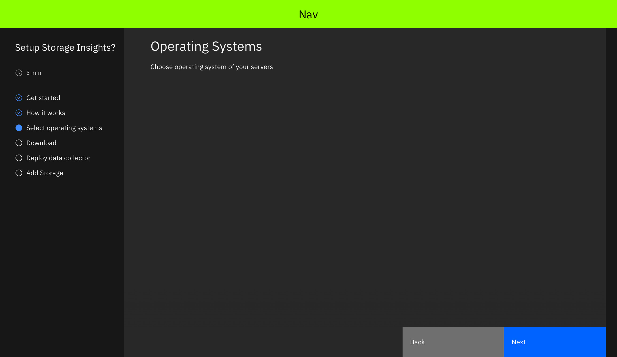
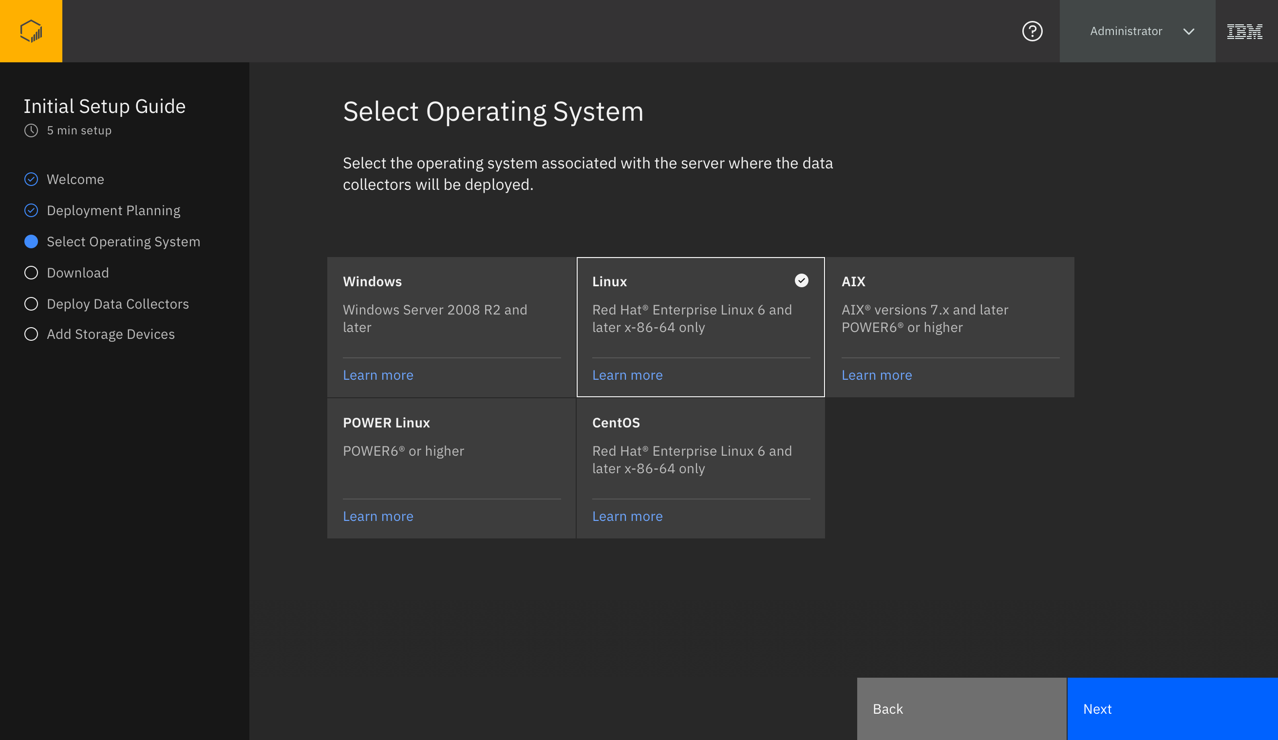
The user will select their operating systems to get the correct data collector files for their OS
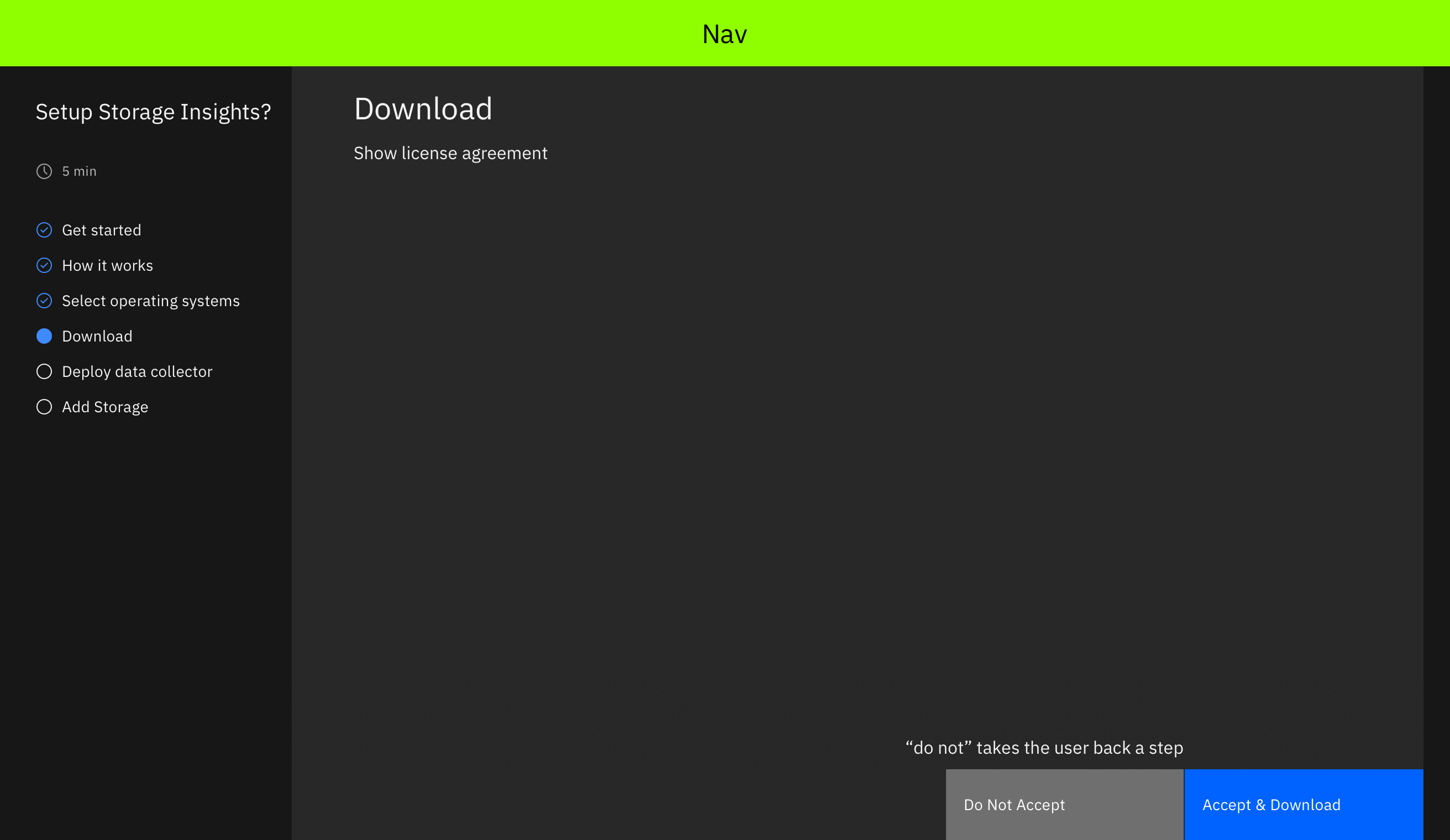
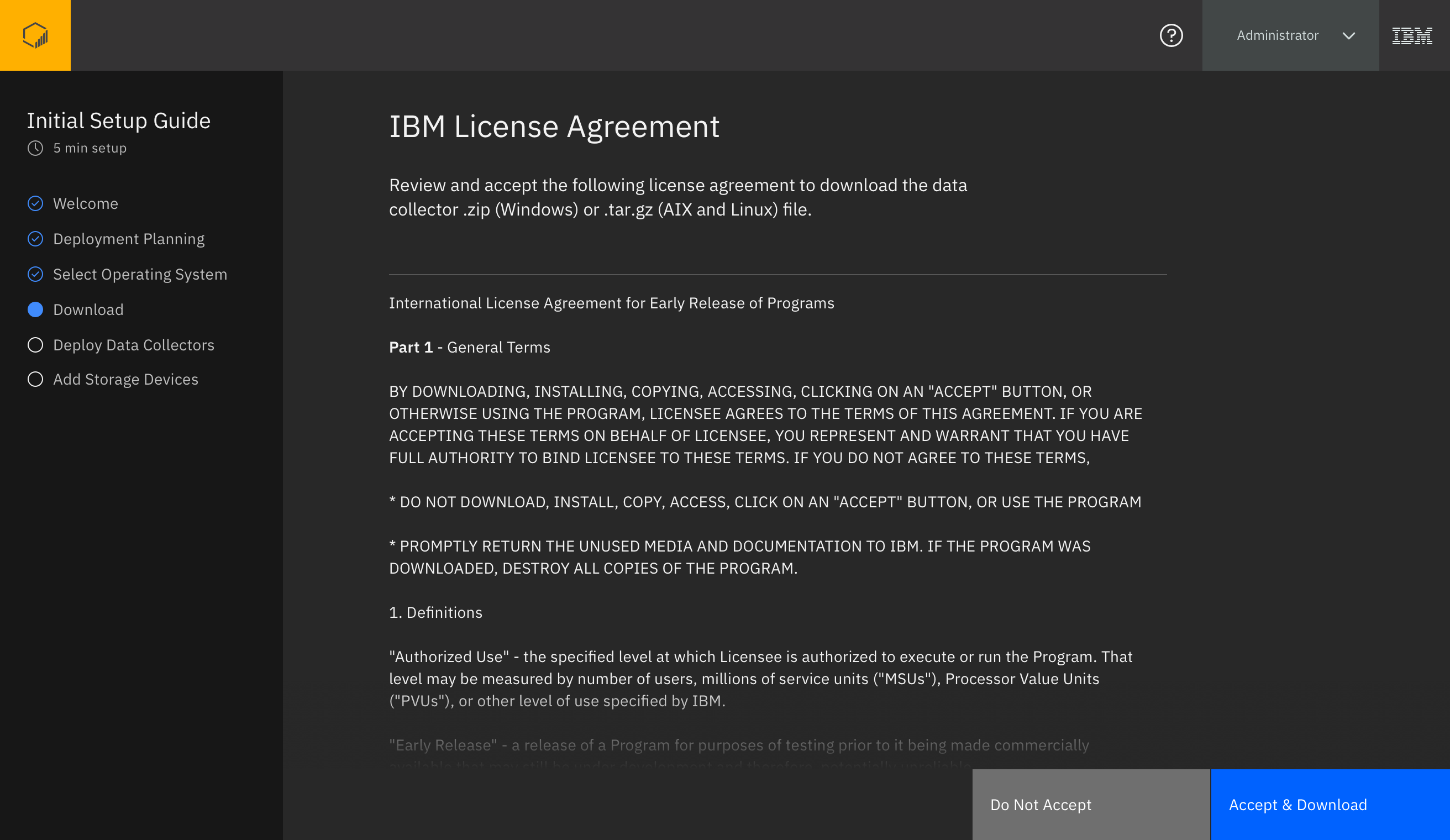
We will show a required legal agreement and download the file to their machine upon acceptance
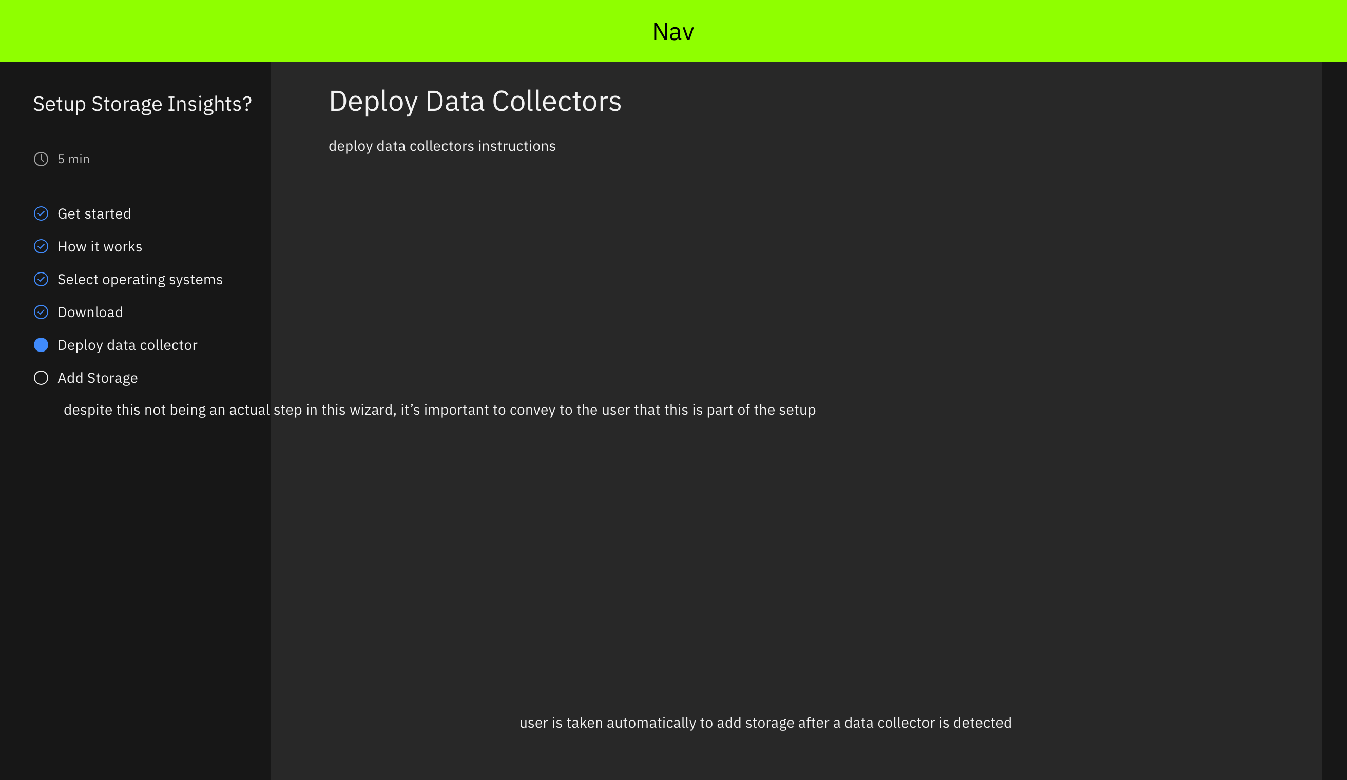
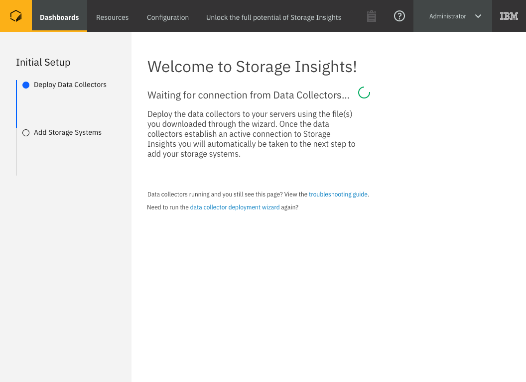
Finally, we will detail how to install the data collectors and wait for their installed collectors to handshake with IBM servers
It would have been nice to bundle these files into a self-extracting experience, but because we were on a tight deadline this wasn’t possible for the first release. This means that while we had a nicer way of helping users understand what they need to do, understand the technology, find the correct files for their operating system, and guide them to install those files, the users still had to manually install the files correctly themselves. I noted that this would be a great area for improvement in the future.
Testing With Users
After aligning on the core requirements, I set out to create a version of this design to test with users. I worked with multiple other groups to determine what information we should show, and why. I met with data collector subject matter experts to determine what information we need to show a user to enable them to successfully install the data collector, as well as identify which operating systems the data collector could be installed on. I worked with a content designer to refine the broad guiding text that I came up with welcoming users to the product, outlining what the user will accomplish, and explaining what data collectors are. The content designer, subject matter experts, and I worked together to identify all of the specific technical information necessary for the second page. The content designer worked on the specific phrasing, while the subject matter experts advised on technicalities, and I acted as a go-between to ensure our output was clear, concise, and consumable while still providing adequate information for the user to comprehend the topic. Once I had a version we felt comfortable with, and after reviewing with both my design team and a broader team of stakeholders, iterating, and re-reviewing for alignment, I tested with users.

Welcome screen version tested with users
I conducted a 1 hour testing session with 4 users. Given our accelerated time frame at this point in the product’s release cycle, I wasn’t able to spend time contacting additional users to test with a higher number. I normally aim to test with between 8 and 12 users, however depending on how many personas are being designed for this number increases.
Planning screen version tested with users
The results of this testing were distributed to a smaller audience than the Understanding Storage At-A-Glance project, so instead of a presentation and an executive takeaway document, I explained the results and what will change in a meeting with the stakeholders from architecture, development, information development, offering management, and design.
Welcome screen as tested

Welcome screen at release, incorporating testing feedback
Finalizing The Design
I set out to finalize the design, taking into account the changes from testing. A few key differences can be seen above between the “Welcome” screen as it was tested, and the “Welcome” screen at release. Specific differences between the two are the removal of a confusing and unused navigation element near the product logo in the top left, clarifying the welcome text to feel more personal and explain what steps will be taken more clearly, and adding the ability to log out clearly into the flow for Storage Administrators who aren’t currently prepared to complete the setup. Additional text content changes took place, and I worked with the content designer and data collector subject matter expert once again to target the specific areas of our text that caused confusion, were unclear, or were otherwise misunderstood by users.
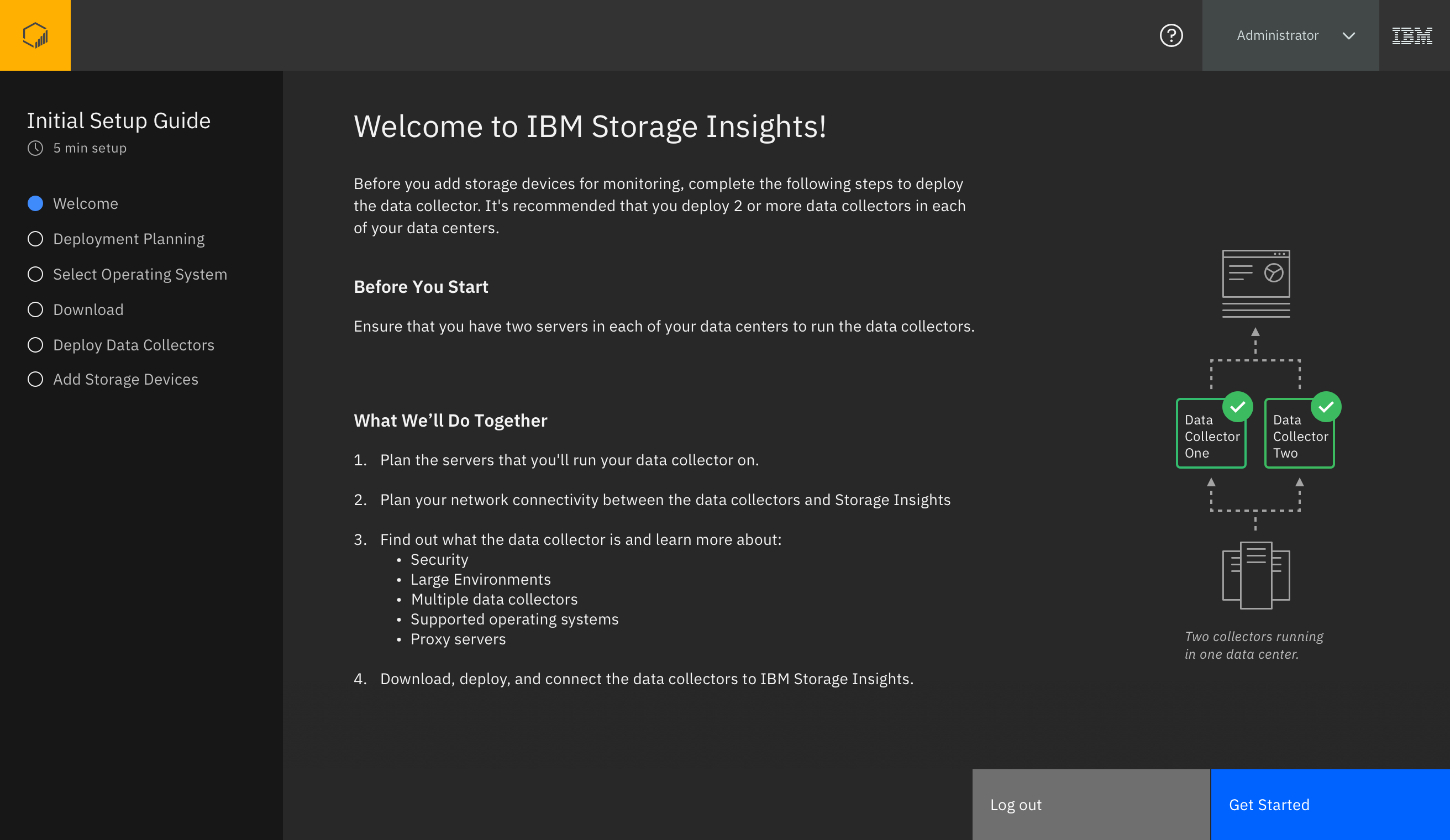
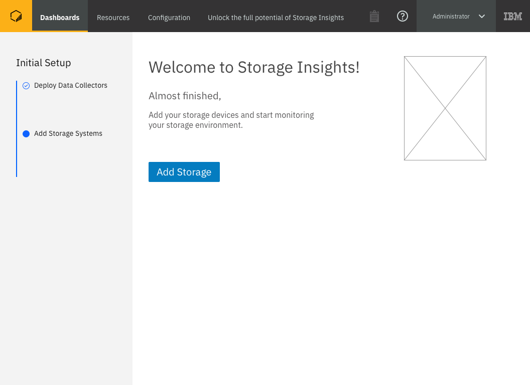
The “Setup” experience as released
Note: The final “Add Storage Devices” step was automatically triggered when a data collector was detected. That step used an existing flow not designed as part of this work.
After updating the design based on user feedback, I again aligned with stakeholders to ensure there were no final reservations with committing to this design. I then walked the development SCRUM team who would be implementing the design through the specifics of the design. Though many of the team members had seen the design throughout it’s creation as part of the stakeholder group I reviewed with, this walkthrough enabled them to ask very specific questions that may have been too detailed during an earlier lower-fidelity design review, and allowed any team members who were not part of the stakeholder group to see the design before working on it. Once the design was handed off to development with a UX Document and Specifications folder (see the Understanding Storage project for an example of those deliverables), I maintained communication with the SCRUM team and worked closely with developers when a question or problem arose with the implementation of the design. As with all of our designs, I worked with our Early Release (beta) team to write scenarios for our beta customers to test, and I audited the finished product when it was available for me to experience on a development machine.