I had recently joined a new product called Storage Insights which is cloud-based enterprise storage monitoring software. My first end-to-end design was creating something that enabled our users to understand which storage systems need their attention, then obtain details about that system. Storage Insights had a dashboard already called the NOC (Network Operations Center) Dashboard, however it was designed be viewed on a big screen in a network operations center.
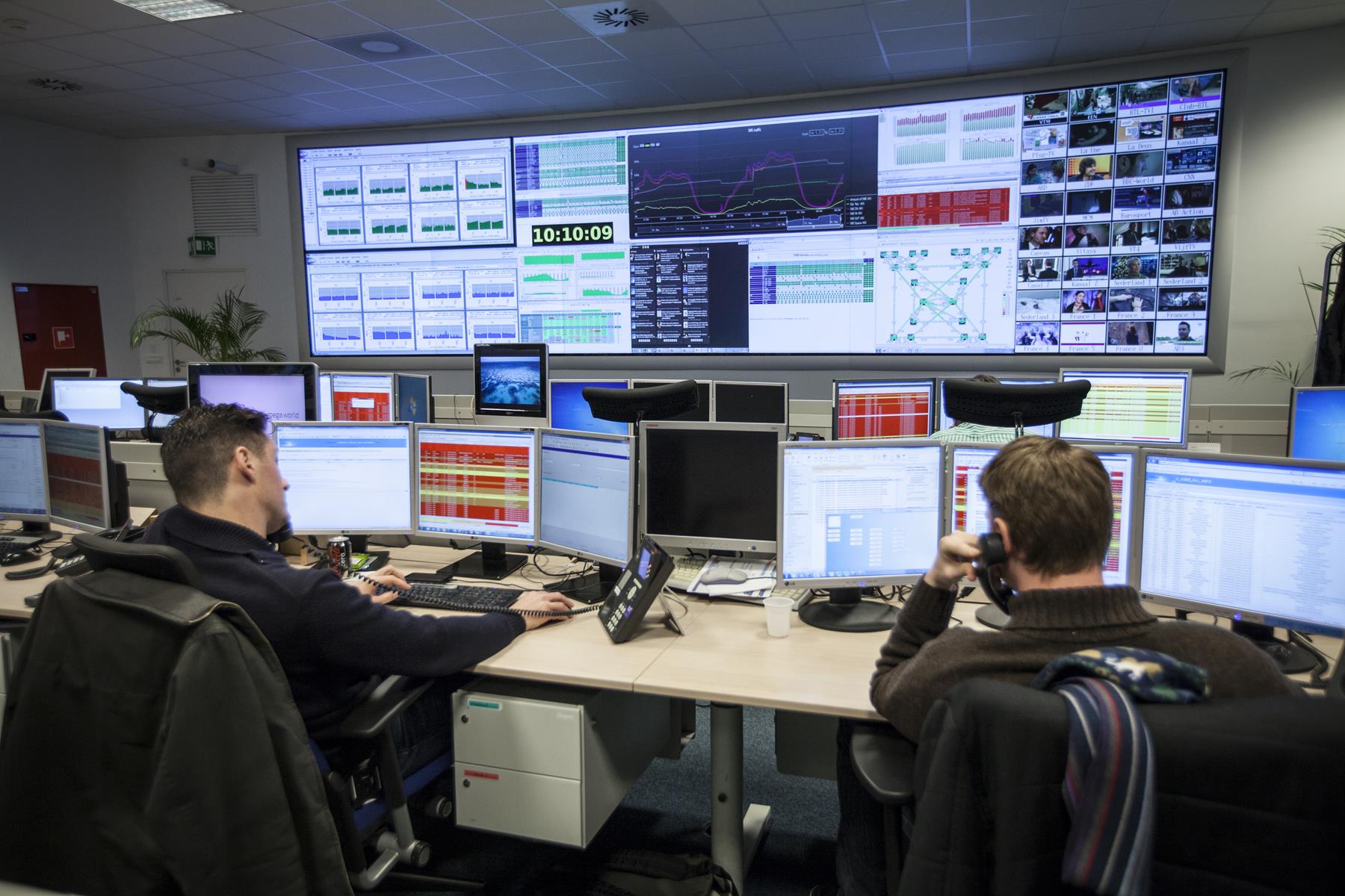
Example Network Operations Center
The NOC Dashboard was the first project I finished (inheriting existing design files) when I joined Storage Insights, so I was familiar with it. For that project my role was simply finishing an in-progress design because it had been promised to stakeholders for a significant amount of time, and the they wanted what they had seen. I didn’t have the freedom to significantly alter the direction late in the project, so I did the best I could and saved my ideas for the next opportunity to optimize how storage system status is communicated. That opportunity came almost immediately after as customers began to complain about the NOC Dashboard.
Customers complained the NOC Dashboard was difficult to use on a laptop screen. The design was made for a large screen where even a small graphic would appear readable. Designing specifically for a large screen made it difficult to interpret and obtain the data they needed when viewed at a laptop resolution. The first thing I did was meet with our Product Manager and the Design Lead to understand what we were trying to create, and why.
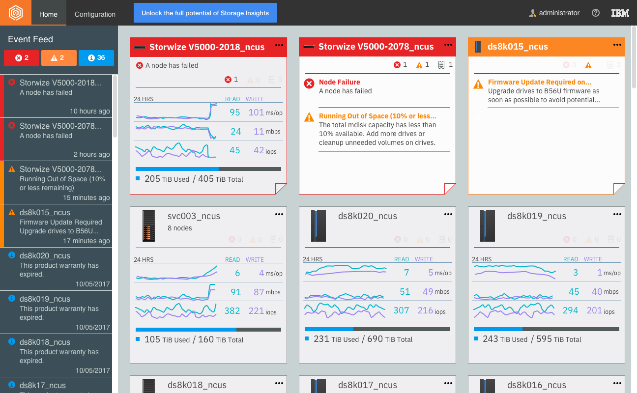
The NOC dashboard
We discussed what Sam, our Storage Admin persona, needed out of an experience enabling him to understand his storage at a smaller resolution. The target was to create an experience focused on device health so Sam knew which devices needed his attention. We had received complaints that the key performance indicators supplied were too small to read and interpret when viewed at a laptop resolution.
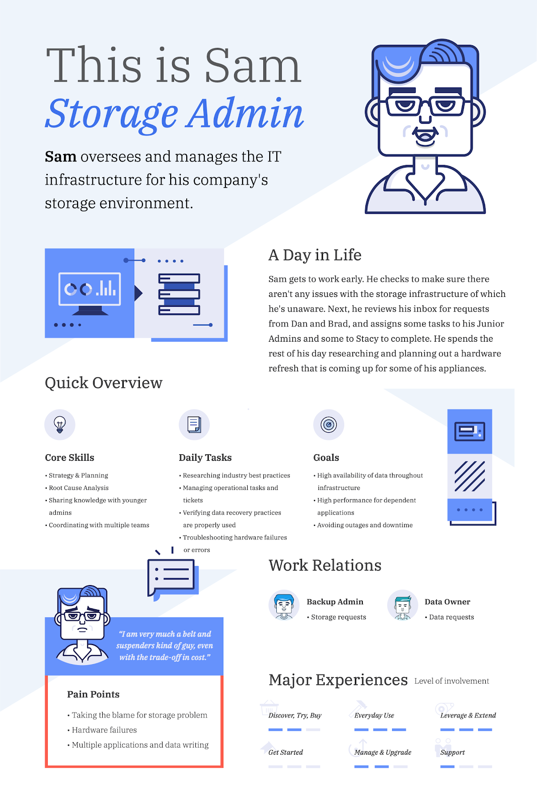
Our Storage Admin Persona, Sam
(Art by Visual Designer Thy Do)
My role on this project was the sole UX Designer, collaborating with my team of other designers working on Storage Insights. A visual designer worked with me to finalize visuals, helping me to be conscious of my use of space, my color choices, and typography. Two tests were conducted on this work, idea validation and a usability test with a design. A researcher joined me for the first usability test, helping me to progress the test script and test structure while I prepared the flow of the scenario and screens we would use for our conversations with users. The second usability test I conducted myself, leveraging feedback and input from my design team peers to help refine aspects of the script and design mockups. During my first year working on Storage Insights every design needed completion urgently and we were pressured to cram as much into the initial releases as possible, so this design was on an accelerated delivery timeline.
Understanding the Need
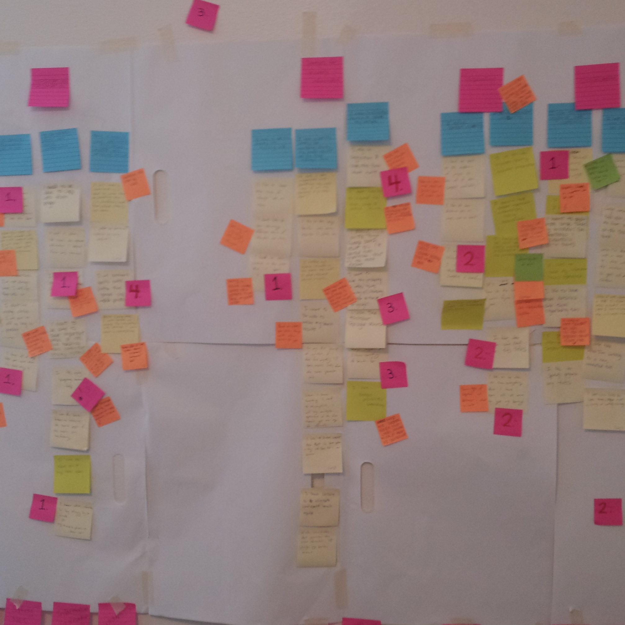
Working together, my research colleague and I drafted a research plan to understand if our target idea met the needs of the customers, and to identify any other critical needs we may be unaware of. I used our existing NOC dashboard to create questions that would help me better understand what users needed from the new experience, such as:
- What user needs does the NOC dashboard meet?
- What user needs does the NOC dashboard not meet?
- What data do users need when they scan their environment for potential problems?
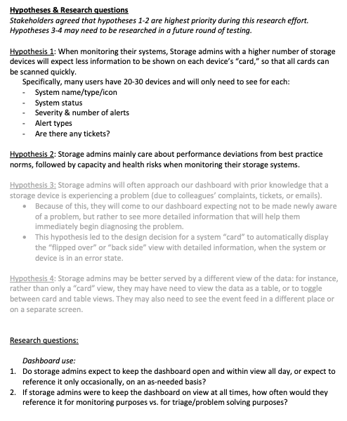
Excerpt from the Research Plan
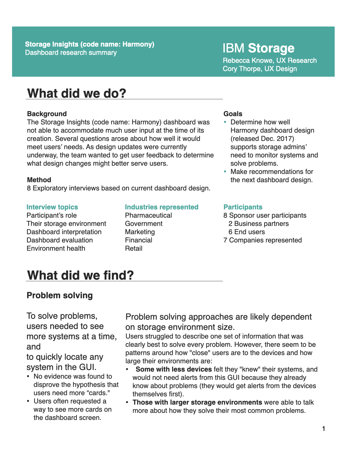
We were able to confirm that health of systems was one primary aspect, however we discovered additional key needs not included in the initial requirement including:
- Ability to quickly move between details about individual systems.
- Enough details to understand the general state of the system.
- eg. Space usage & the general way the system is configured.
- Key performance indicator information that is consumable at a laptop resolution
Some of these needs existed in the NOC dashboard, however because of the complaints we received about how that data translated to a smaller resolution, we paid particular attention to size and amount of detail.
Aligning on Findings
We took these findings to the Product Manager, Technical Architects, and Design Lead, and explained why we should include not only the health-focus need in the design, but additionally target the specific additional needs that came from the user interviews. This was a very high priority and high visibility project and garnered attention from our executive team, who decided to attend our research playback. Normally, our executives didn’t attend research playbacks. We supplemented the presentation with an executive briefing to tailor our message to our executive audience.
Research Executive Briefing Page 1
Research Executive Briefing Page 2
After meeting with our stakeholders and explaining the results of our research, I began low-fidelity mockups. Since our team was new to this product, we hadn’t established our design process yet, so our alignment was more ad-hoc than I’m comfortable with today. We now create many additional helpful alignment deliverables depending on complexity of work, including:
- User Stories, User Flows, Data Models, Inspiration/Mood boards, Design Thinking activities such as the prioritization grid, and more.
During this project, time constraints and lack of established process meant less initial alignment deliverables were created.
Initial Mockups
I began my design explorations with our 3 key user needs in mind:
- Users should be able to determine health easily to prioritize device investigation.
- Users need to be able to easily consume key performance indicators and device configuration at a laptop resolution.
- Users must be able to easily navigate between devices.
Additionally there was a “bonus requirement” of sorts. I knew we planned to expand this product to monitor more devices in the future. At this time it only monitored 3 types of storage. Though not an official requirement, I identified this need as crucial to keep in mind – what will this experience look like when our list of device types grows to 5? to 7?
Initial low-fidelity mockup concept 1
Exploring less prominent device type selectors
As I explored ideas, I brought some design elements into a higher fidelity to better understand how they might work, though in many cases ultimately went in a different direction. For example, the selectors seen across the top of these mockups (directly below the navigation) enabled the user to switch the list along the left side between device types.
Device type selectors now include status
Concept 1 in medium/high fidelity
Through multiple concepts, iterations, and reviews with my design team, I ended up exploring less prominent ways to call attention to the ability to switch between different device types.
Low fidelity concept replacing bubbles across the top with expanding list sections on the left side
Example of a non-default section expanded with default section collapsed
Those iterations and reviews helped me to realize that the information in the selectors was only important when the user wanted to switch between device types. I created a proposal that removed the device type from view, and nested that information in a dropdown menu.
High-fidelity proposal nesting device type sections in the menu
Avoiding Scope-Creep
As part of my exploration into how this view would grow when we introduced other devices, I evaluated concepts such as how to show the relationship between a selected device and other devices. One exploration involved using the device list to show a selected device’s relationships. I created a few prototypes to explore these ideas, trying to understand how a user would go from a list of devices to looking at a device and it’s relationships in the same list location. Ultimately the concept proved too complex to easily communicate without a significant investment of time, and I came to the realization that the idea didn’t address a core need of the minimum requirements. To avoid scope-creep from what may have been a good idea, but went beyond the needs at this stage of the experience’s design requirements, this idea was put on hold.
Links Change Context Concept
InVision Clickable Prototype (pw: abc)
Testing the Prototype
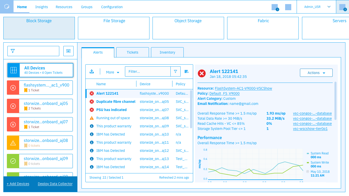
After rounds of iteration and review with the design team, technical architects, developers, copywriters, and other stakeholders I had a medium/high fidelity design I was ready to test with users. In those rounds of review I would bring my current design proposal along with any supplementing material (flows, data diagrams, or what I thought helped tell the story of the experience at that stage) to a meeting with the stakeholders. In the meeting I would briefly explain the needs I was attempting to address in the design, highlight where I had iterated since our last meeting, and walk the stakeholders through the experience as I proposed it. This enabled stakeholders to understand the progress of the design, ask questions, offer input, and explain any technical constraints that may have been not obvious. I took my medium/high fidelity design and walked users through a scenario-based usability test in order to understand what worked, and what didn’t. I tested with 8 users for 1 hour each.
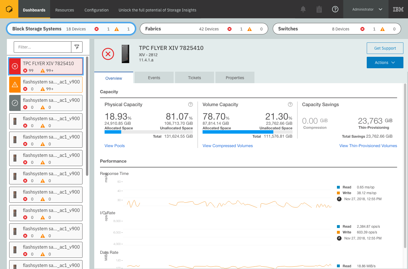
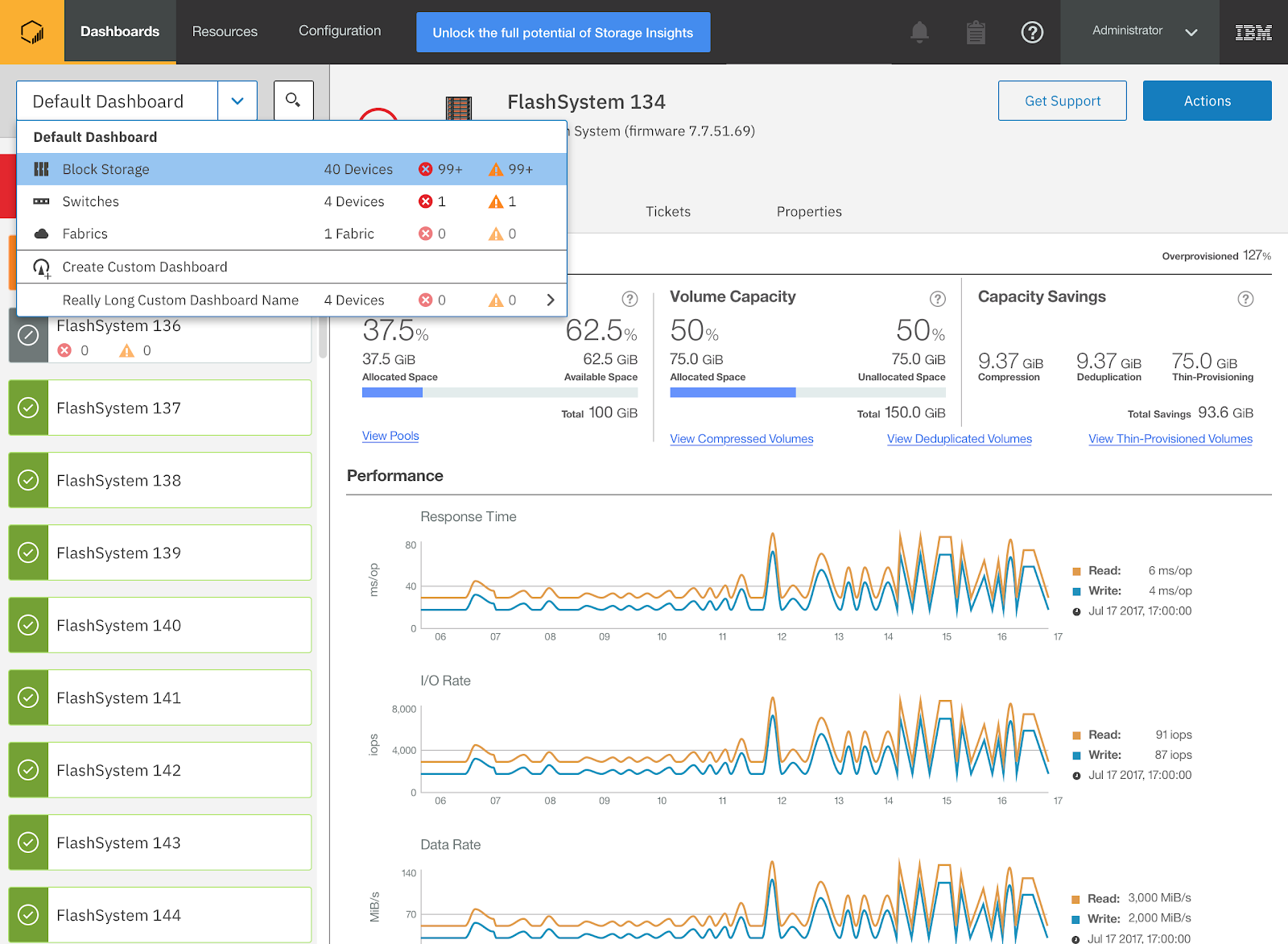
Medium / High fidelity design tested with users
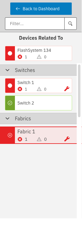
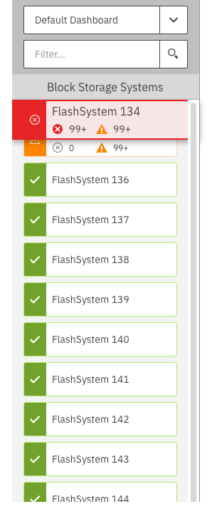
Example of menu open showing devices and health status
Results & Updates
Testing feedback was generally positive. Users liked the simple and straightforward nature of the design which defaulted to the first system selected, and always showed the details of the selected system rather than having the details open and close. This was a departure from our NOC Dashboard which featured multiple animations, and forced users to interact before seeing detailed information about a system which would display in an animated panel opening from the side of the screen. The user feedback drove changes to the layout of the system tiles (the list on the left side of the screen) making them more informative by providing context about why a device was in an error or warning state. Additionally the layout of information in the details section changed, both by adding a new System Health section, and updating the way the Capacity numbers were calculated and displayed. I iterated on the changes from the testing, going through additional update and review cycles with the design team, technical architects, developers, copywriters, and other stakeholders. Some of the user’s primary pieces of feedback can be seen in the updates, including:
- A clearer indication about what device types you’re looking at, and why a device’s health is bad (in the tile on the left, and System Health section on the right).
- A simpler filter, styled like a normal text input, that works like a standard search field.
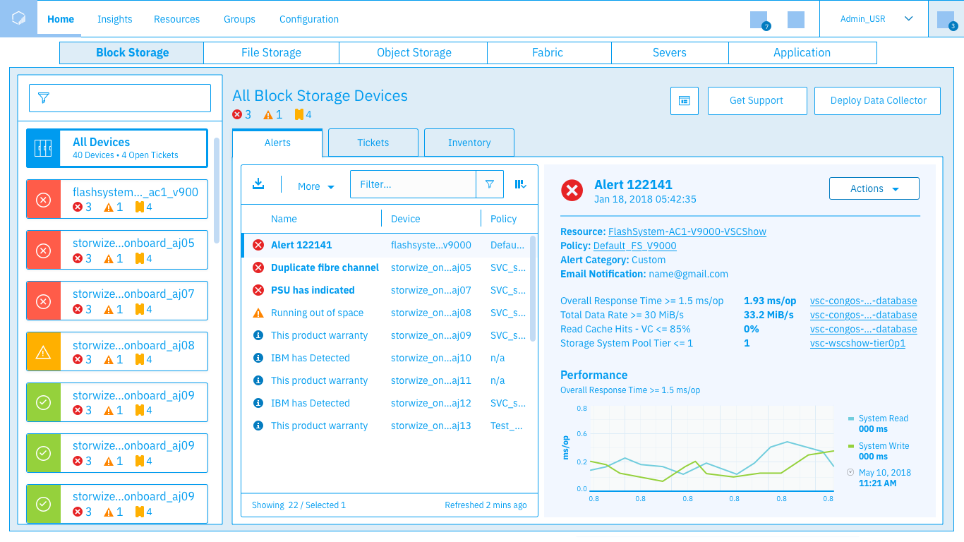
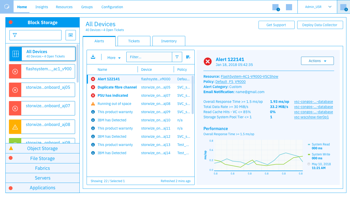
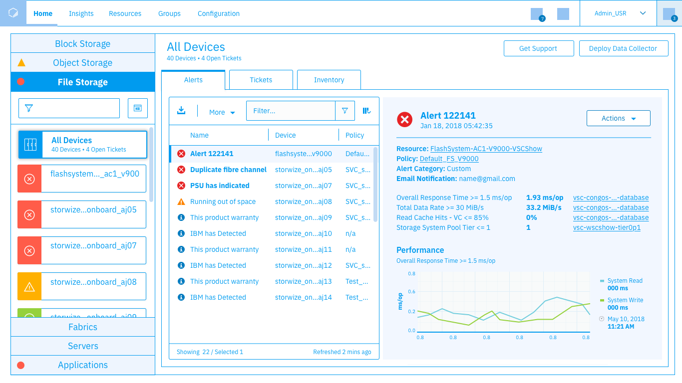
Updated proposal based on user feedback
Note the updated filter, device list header, and new System Health section
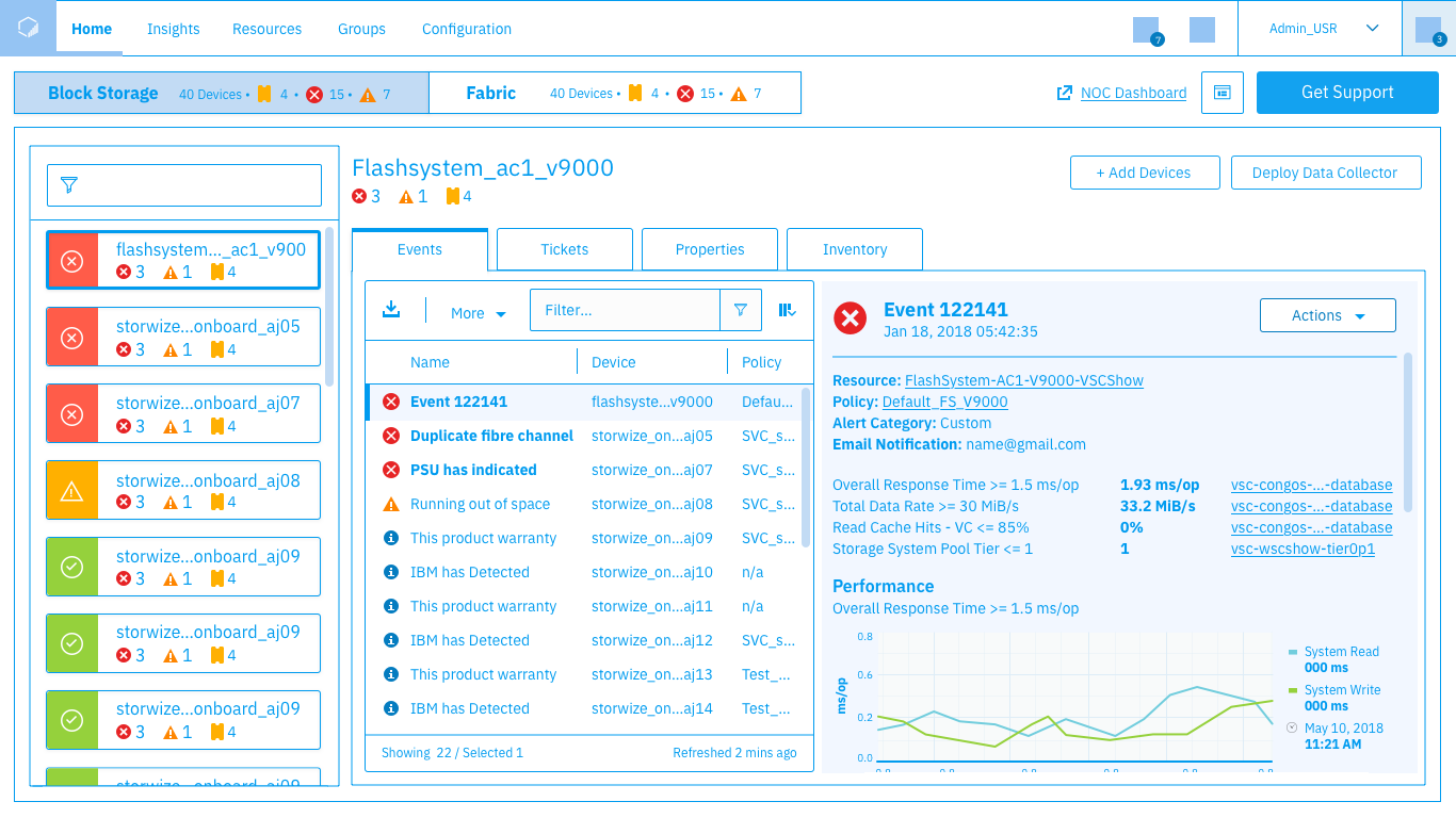
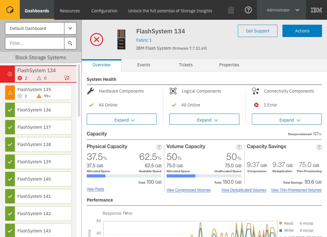
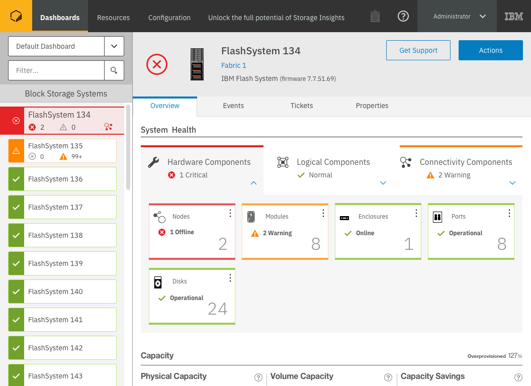
An important part of the updates was a clearer understanding of the system’s health. Here’s a mockup of that idea which rolls up health about component types, and can expand to show specific sections of the system as seen here. I then presented the testing results and demonstrated the changes to our stakeholders, explaining why the reactions and comments users made about understanding health causes resulted in my design choices to better explain how the device health was determined.
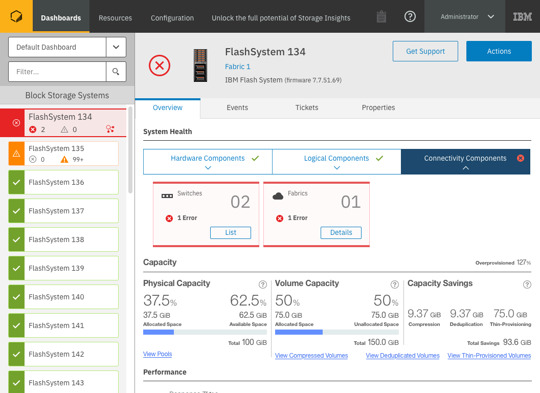
Concept with System Health section expanded
Implementation Deliverables
After gaining agreement about the release readiness of the design I created a User Experience Document, or UX document. A UX document is PDF document outlining all of the specific implementation details of the design. I met with our development team, who had seen progress on the design along the way as part of the stakeholder group, and went through the UX Document with them in detail in order for them to plan implementation and ask more detailed questions than they would have asked at the in-progress design stages.
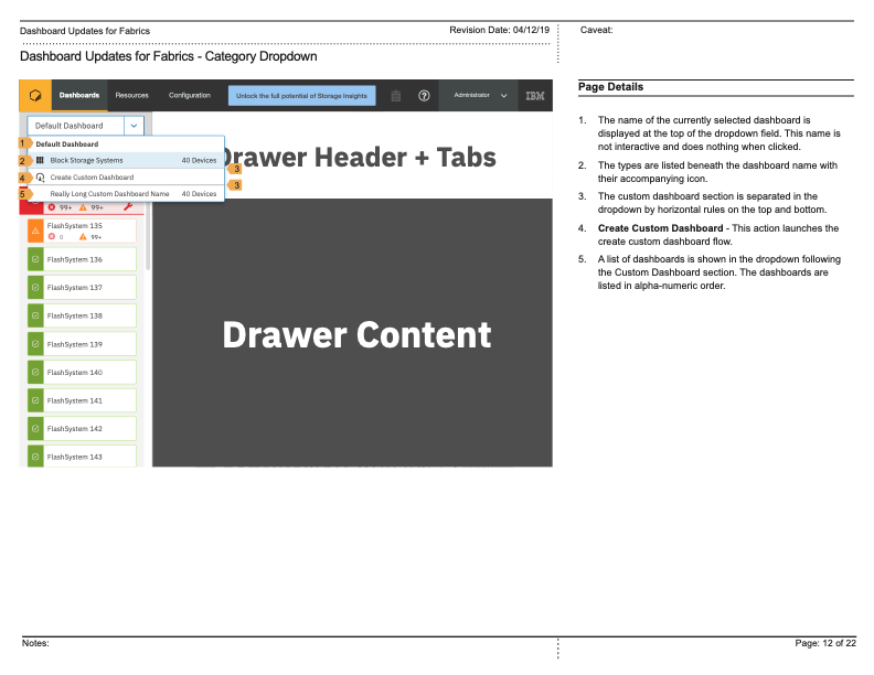
Excerpt from the UX Doc detailing the Menu
Each of our designs was also delivered with a fully interactive specification HTML file, which developers could interact with to see the measurements of the design elements, colors, icons, and other details. In this case I also delivered a simple prototype to demonstrate the common interactions of the menu. This prototype was created in Sketch and didn’t quite communicate the specific way I envisioned the device tile “sticking” to the top or bottom of the list when a user scrolled. Because I had a very specific vision of how this would look and feel, I animated this idea and included that as well to illustrate my vision to the developers.
Behavior of “sticky” selected tile which didn’t animate in Sketch prototype
Google Drive MPEG File Link
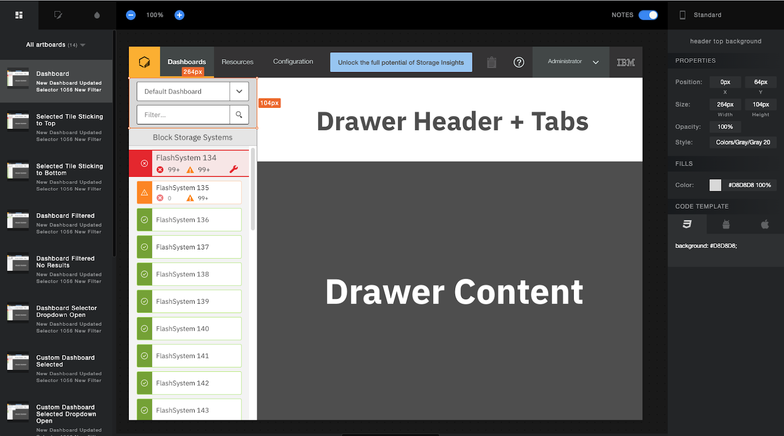
Interactive spec file with measurements, colors, and icons delivered to development
Google Drive MOV Example
Simple prototype demonstrating common user interactions
Google Drive MOV File Link
While I started to work on the next design, development began implementation. I supported the implementation as questions arose about things that for one reason or another weren’t able to be implemented the way we envisioned and agreed upon. I worked with our beta team to draft test scenarios around this design so that when released into beta, we could obtain pre-release feedback about it and identify any important changes that may be needed before release. While the implementation was in beta, I audited the implementation on our developer machines to ensure the code matched the design, and to identify any bugs or experiences that weren’t working the way they were designed. Though we had a QA team who also did this, I felt it important that the person who’s closest to the design also validates the implementation.
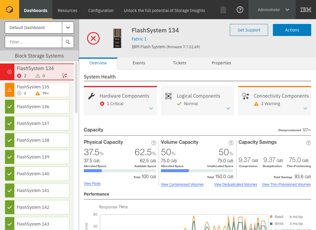
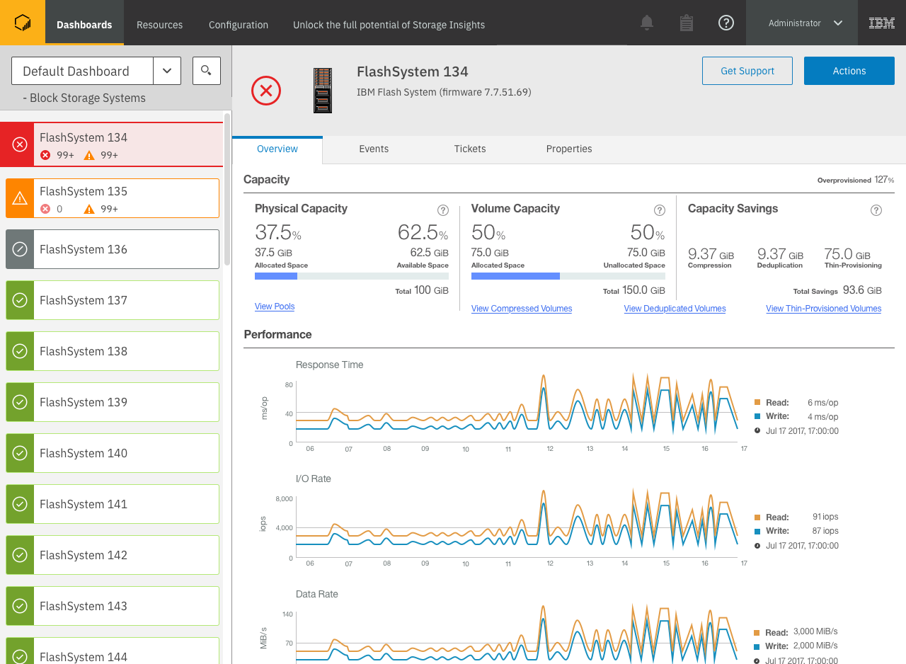
The final Operations experience, with the System Health section expanded